CUCINE ZERO NINE
Cucine Zero Nine sells high-end kitchens that are beautifully designed, both in terms of aesthetics and functionality. The company’s new identity needed to be every bit as sophisticated. We developed a logo that is minimal, pure and contemporary, stripping back the typography to the simplest lines. Conscious that the products should always be hero, and mindful that the website would be a key selling tool, we ensured that photography would be hero for maximum stand out. A growing reputation has seen the business establish relationships with property developers and architects, as well as being commissioned directly by individual clients.


/Strategy /Branding /ecommerce website /poS /advertising /art direction
EALING IN LONDON
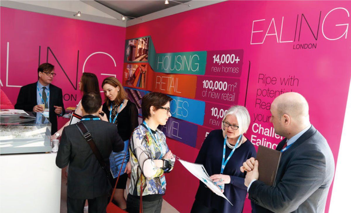
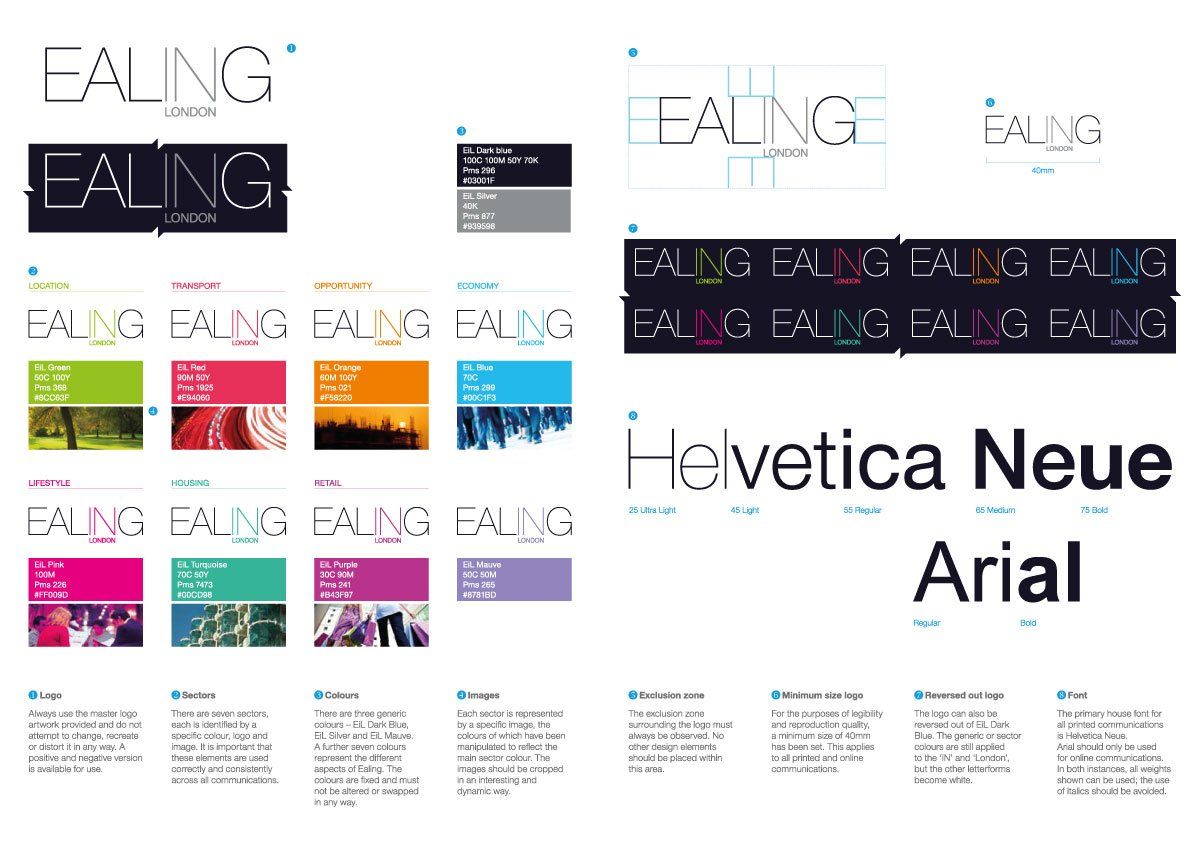
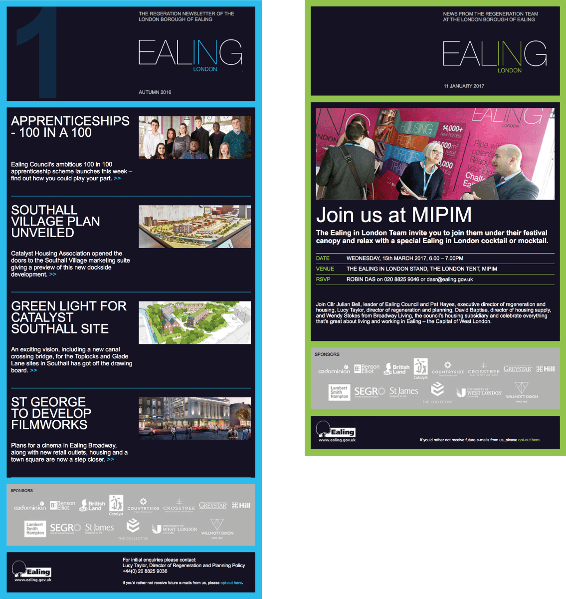
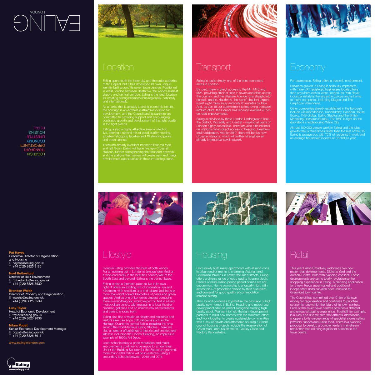
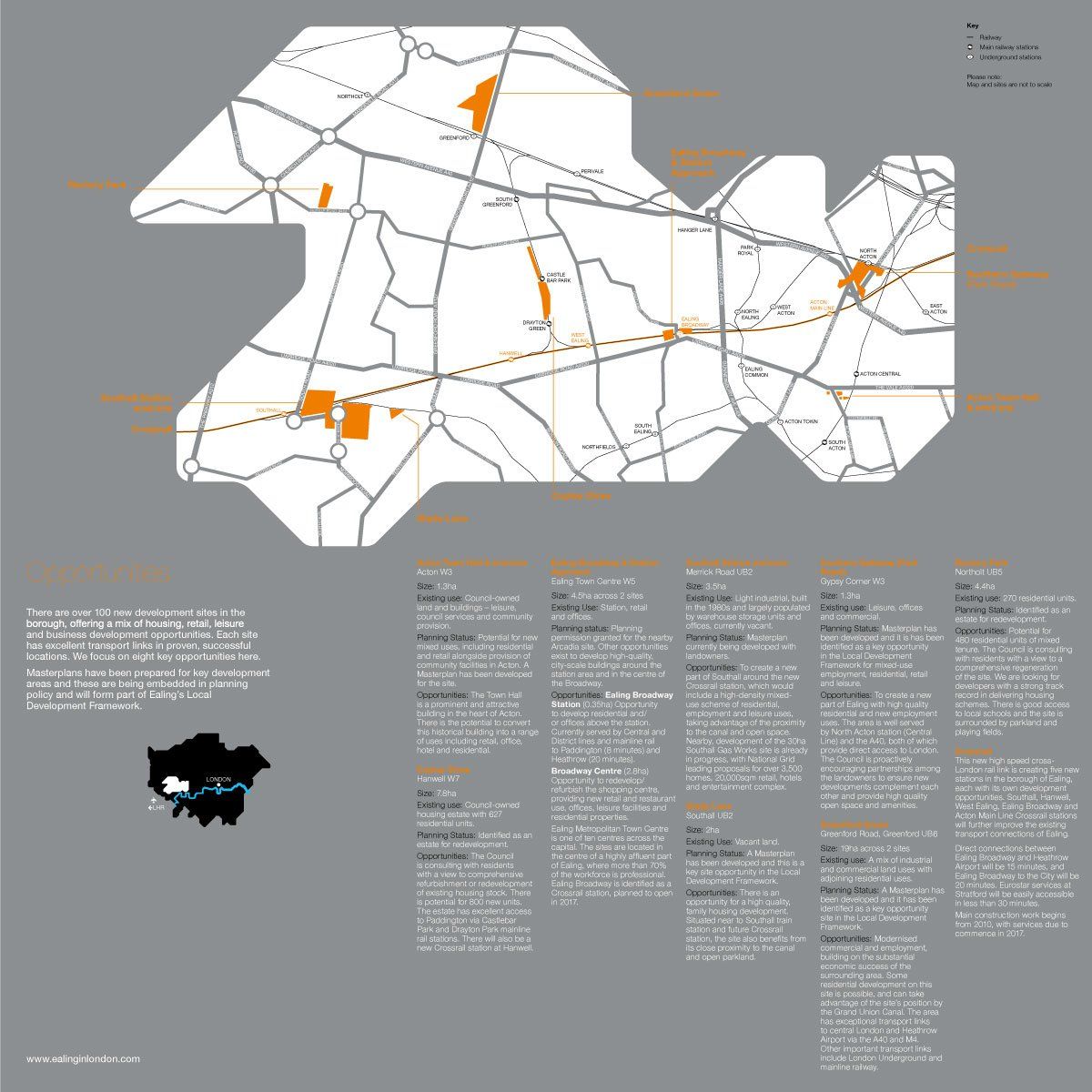
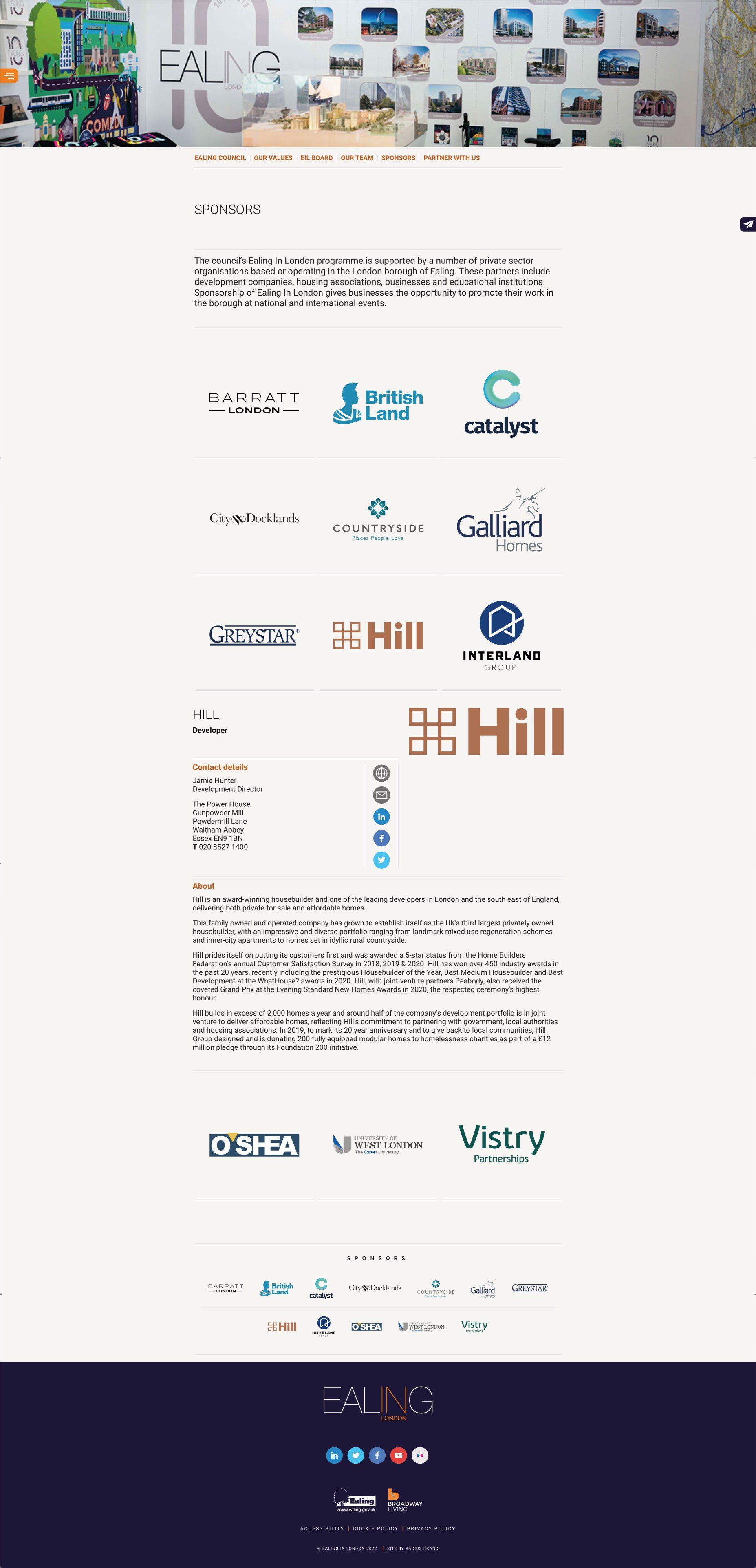
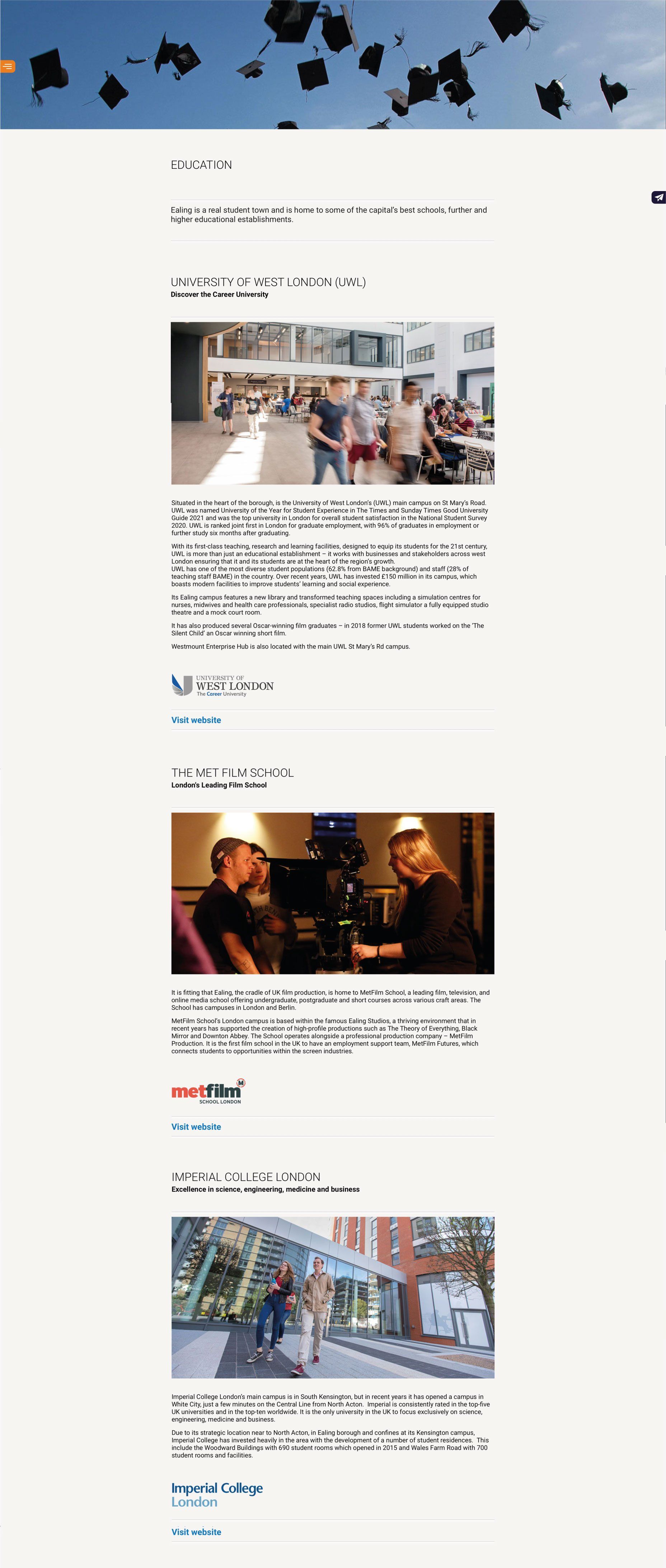
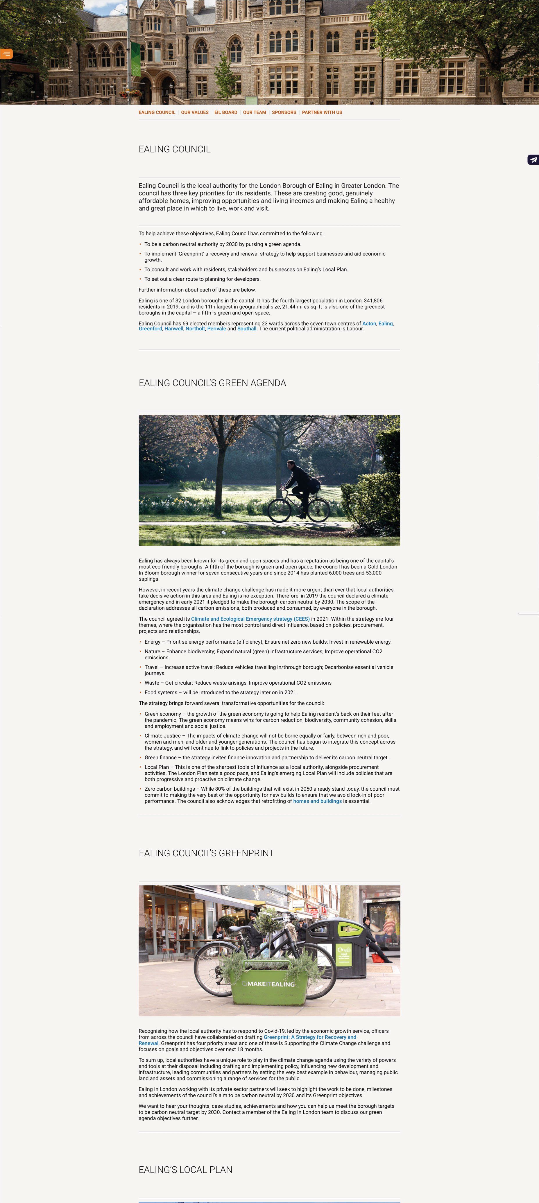
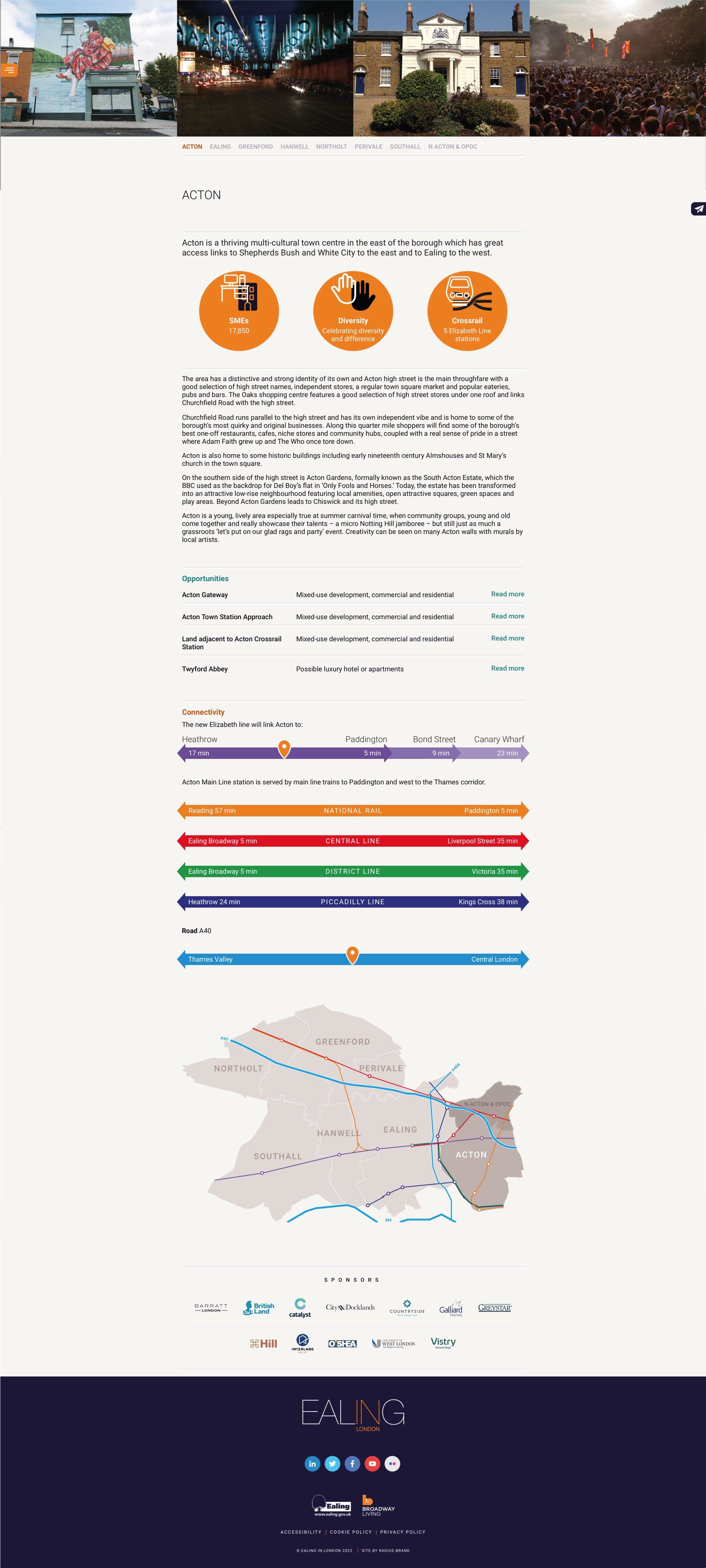
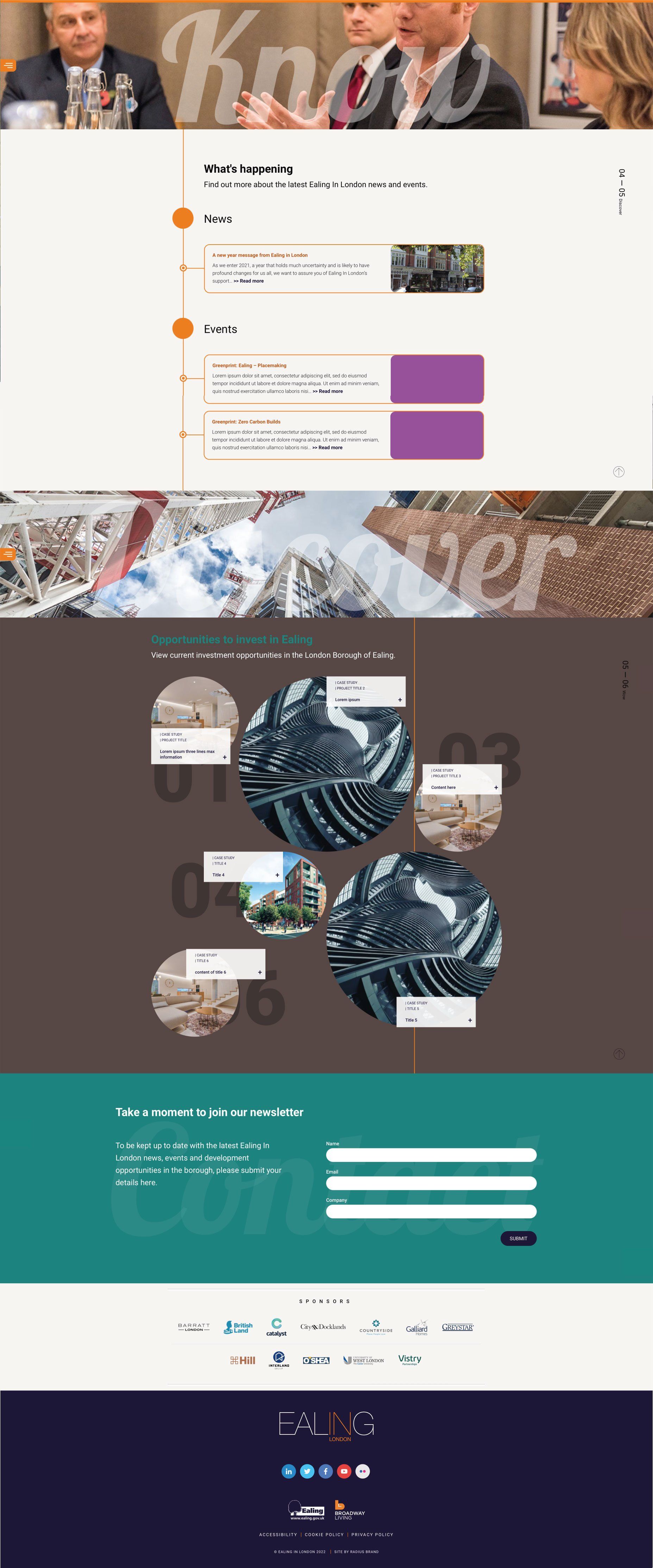
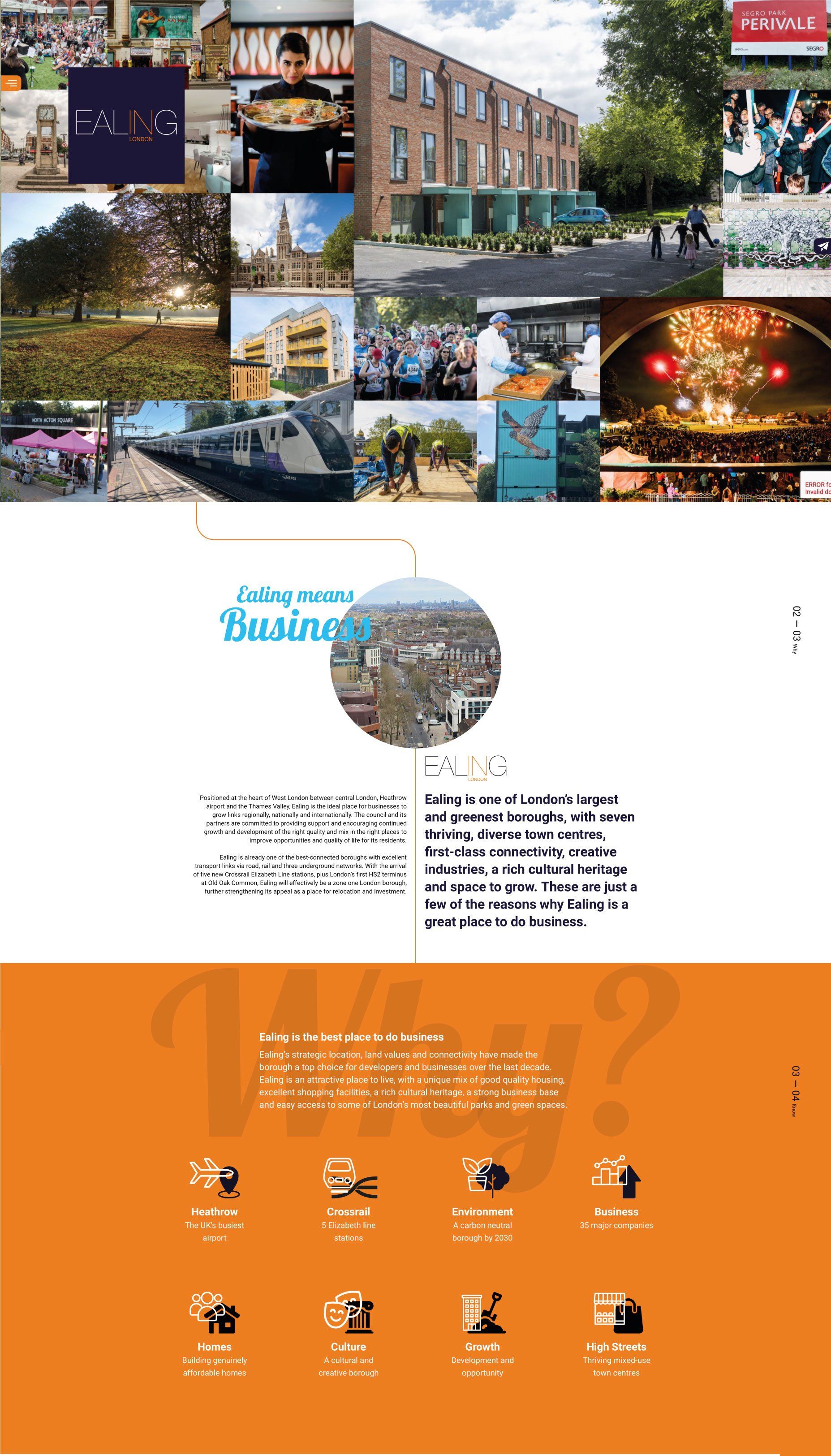
In 2009 Radius created the Ealing in London brand, which would allow Ealing Council's regeneration team to promote Ealing on an international level as a viable investment opportunity. Our remit included a website and supporting communication materials and marked the beginning of a long-standing relationship. In line with technology developments, the website has been overhauled and redesigned several times to provide better functionality and improve the way in which the team engages with its audience.


YUTAKA
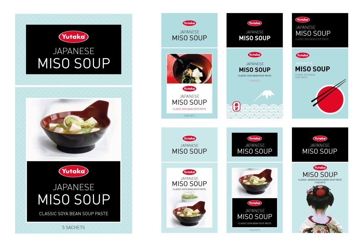
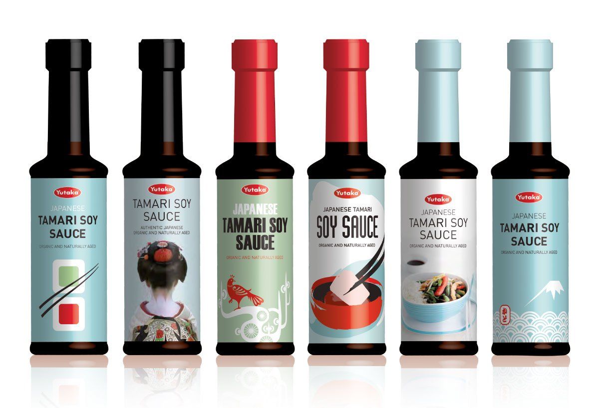
Losing market share, reduced to limited shelf space or even delisted, it’s every FMCG brand’s worst nightmare. Invited to pitch for the redesign of packaging across several of Yutaka’s authentic product ranges, we drew inspiration from the elegant simplicity of all things Japanese. Our concepts explored the use of product shots and iconic graphics to segment the range. Colour was key to differentiating the range on shelf and a metallic finish added to the visual impact.
I2Q
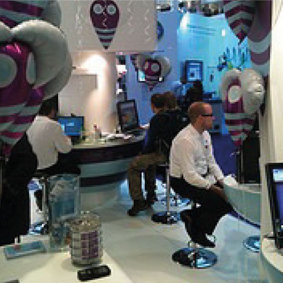
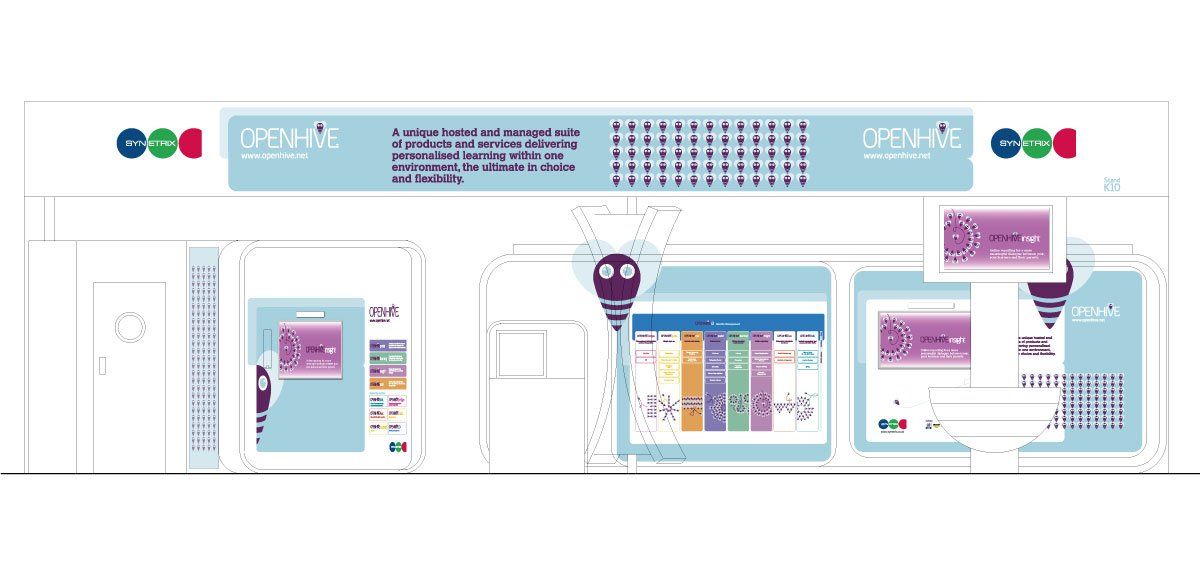
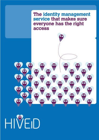
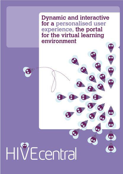
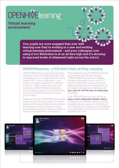
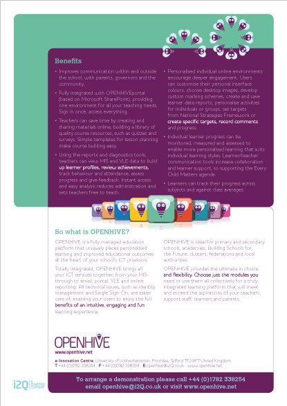
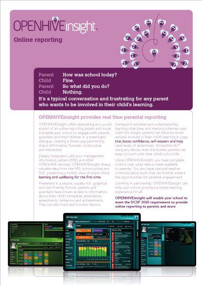
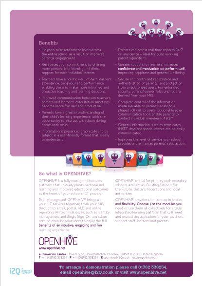
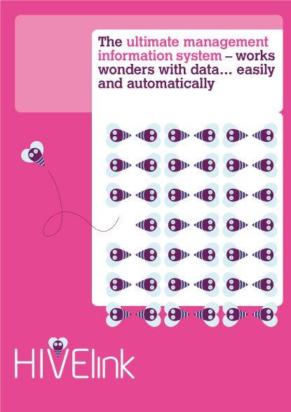
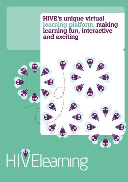
Creating a brand for a new IT product entering the education sector required a highly strategic approach, including research to gain insight into the audience and their needs. Having established a compelling brand proposition, name generation followed and a range of brand concepts developed for testing. The chosen brand and visual identity was implemented across all marketing communications. OpenHive was launched at BETT, the world’s largest educational technology event, and quickly started winning business from schools all over the UK.
New Paragraph



chartered institute of marketing
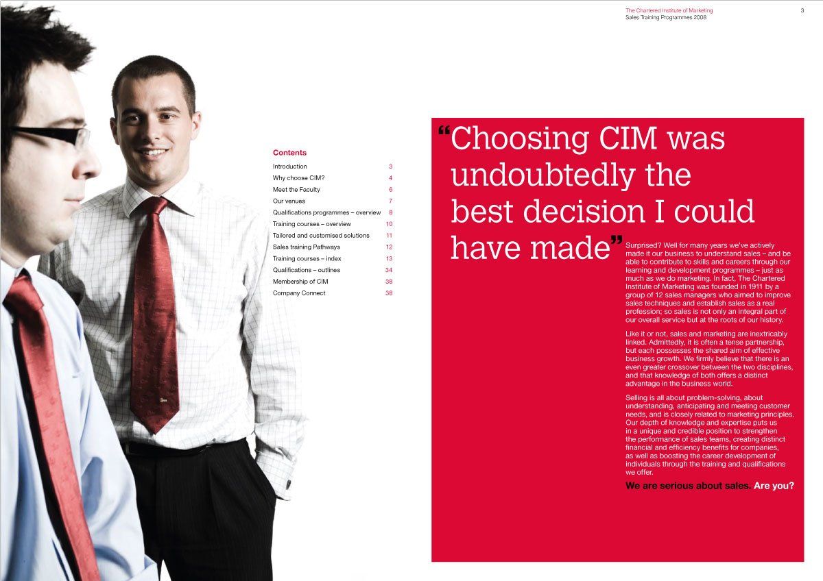
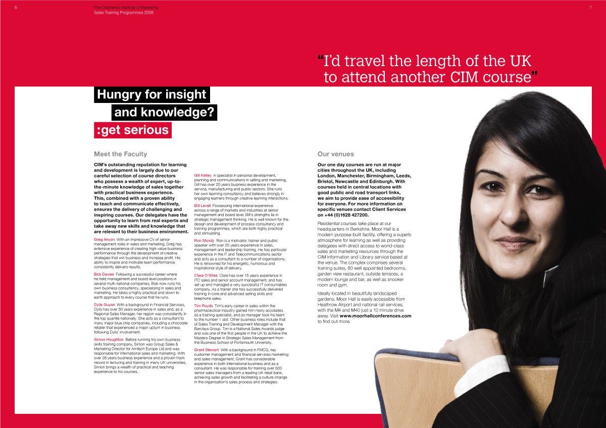
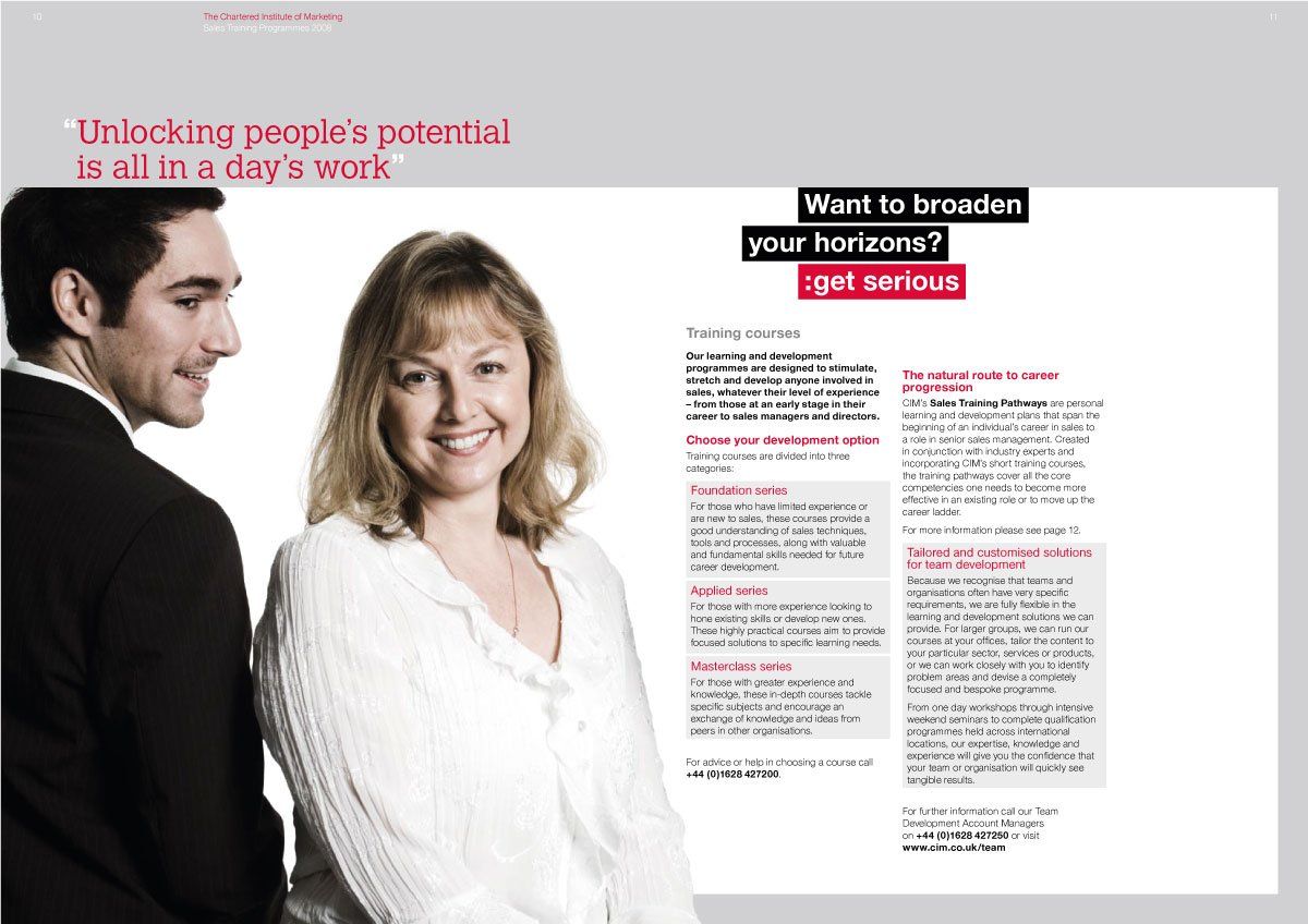
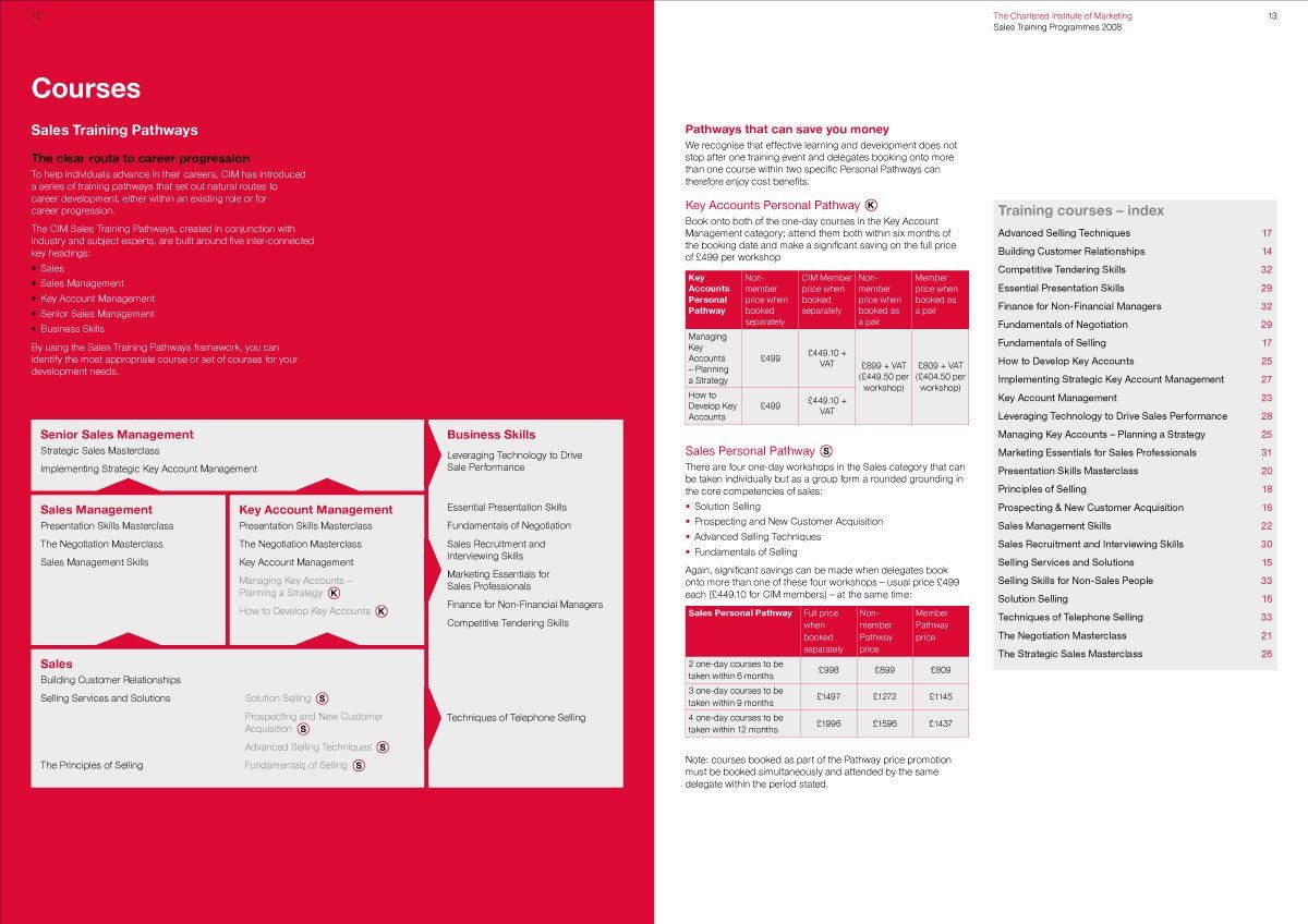
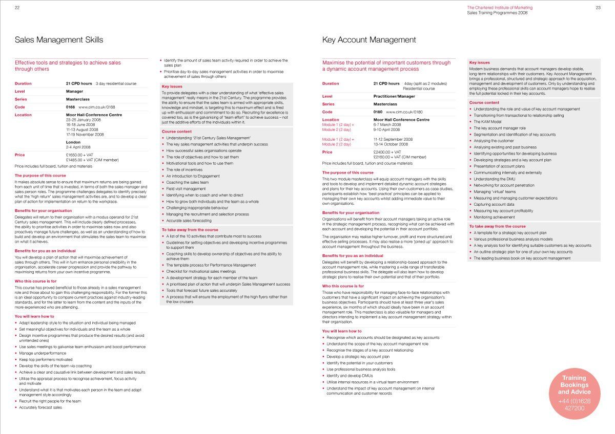
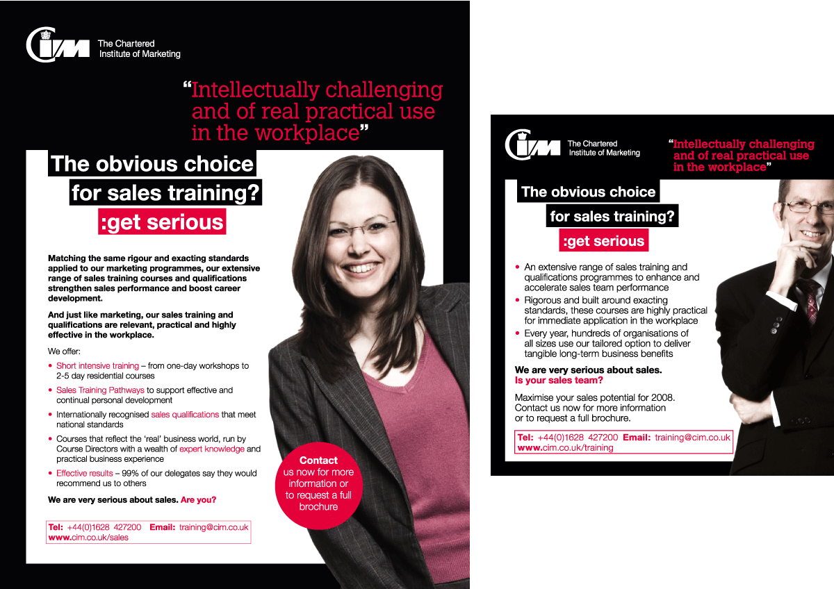
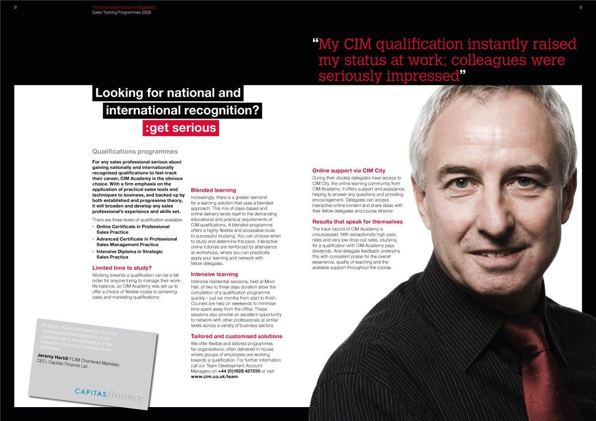
An excellent reputation for marketing qualifications had somewhat overshadowed CIM’s expertise in sales. Radius was asked to design a marketing campaign that would clearly convey CIM’s sales offer to HR and learning and development departments, as well as to individuals wanting to improve their career prospects. Central to the communication materials was the Sales Portfolio, which would act as a course directory and, importantly, challenge the preconceptions of CIM’s ability to deliver credible sales training and qualifications. The campaign, which ran across direct mail, print and digital advertising, successfully bolstered delegate numbers.





JOHN LEWIS
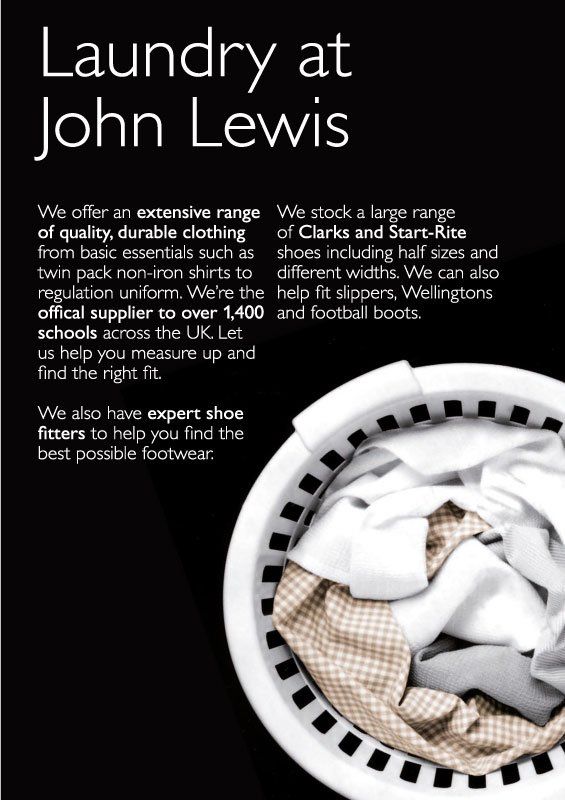
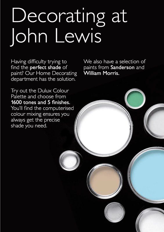
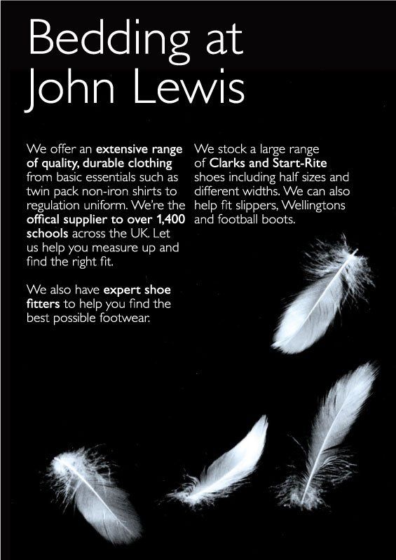
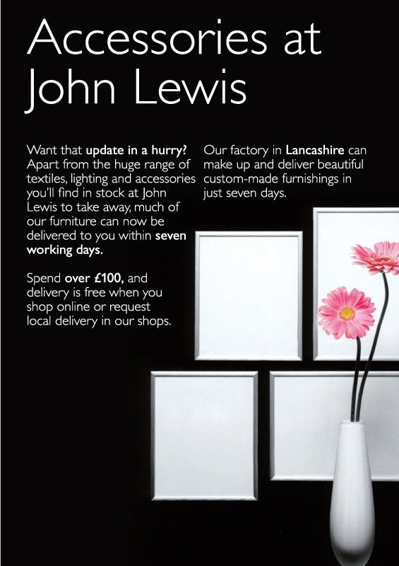
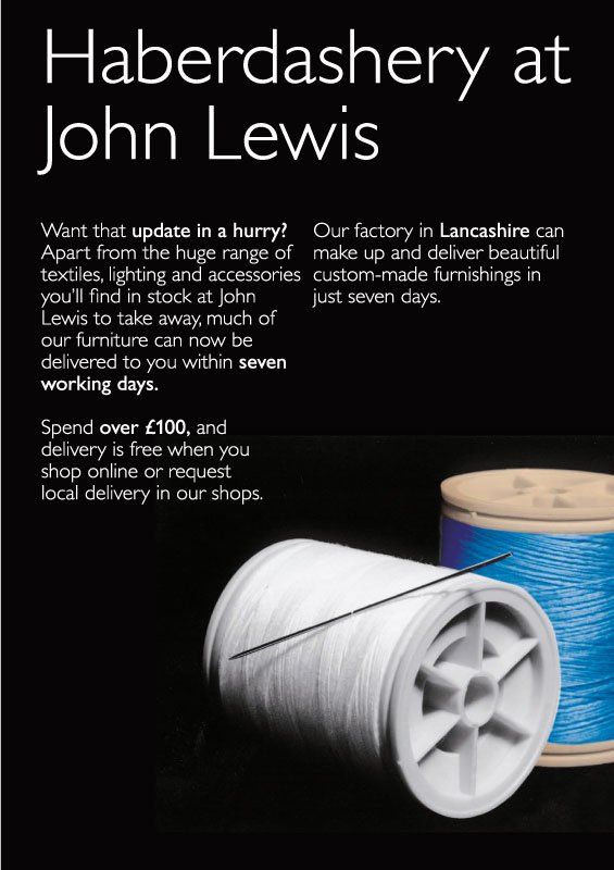
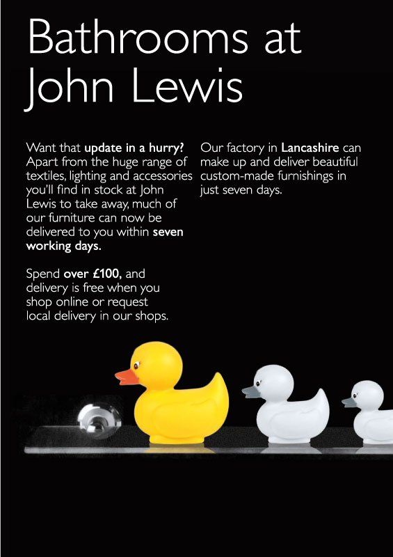
Following a review of customer behaviour within John Lewis stores the number of sales staff on the shop floor was reduced. However, it became clear that better customer communication would be required. We developed a range of initiatives to create a distinctive style of communication that was clear, informative and inspirational, embodying the retailer’s brand values. From perimeter way-finding signage to mid-level signage delivering product and service information and right down to shelf-edge ticketing, we developed a system that enabled customers to easily navigate the store and its departments, as well as helping the decision-making process at product level.
LE CREUSET
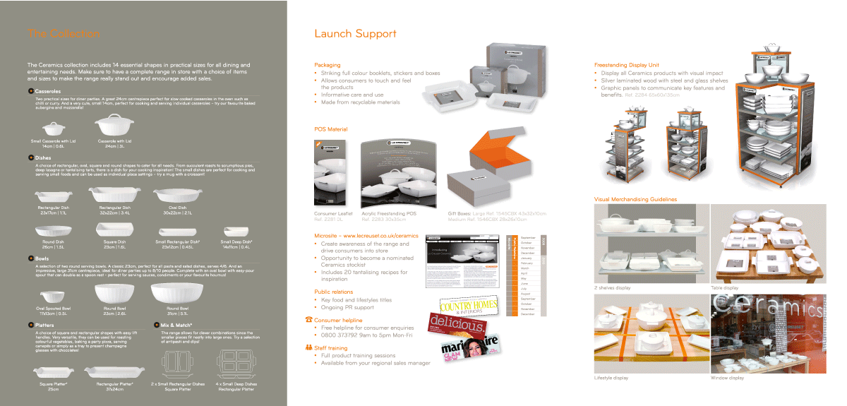
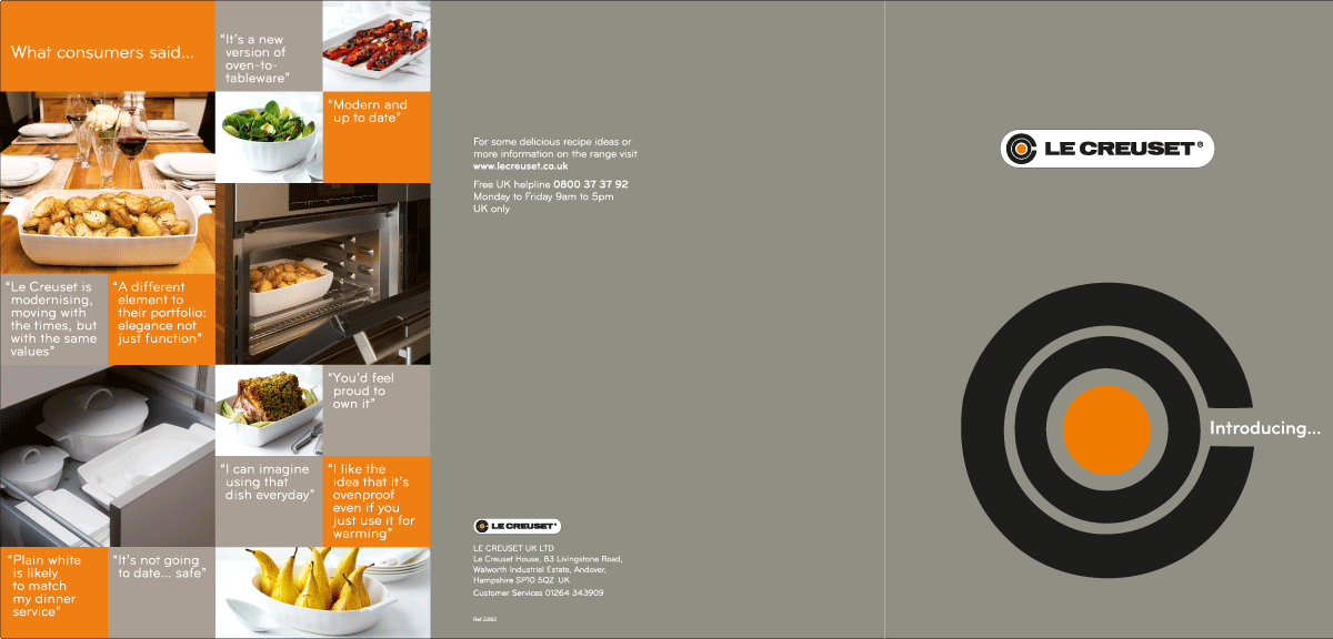
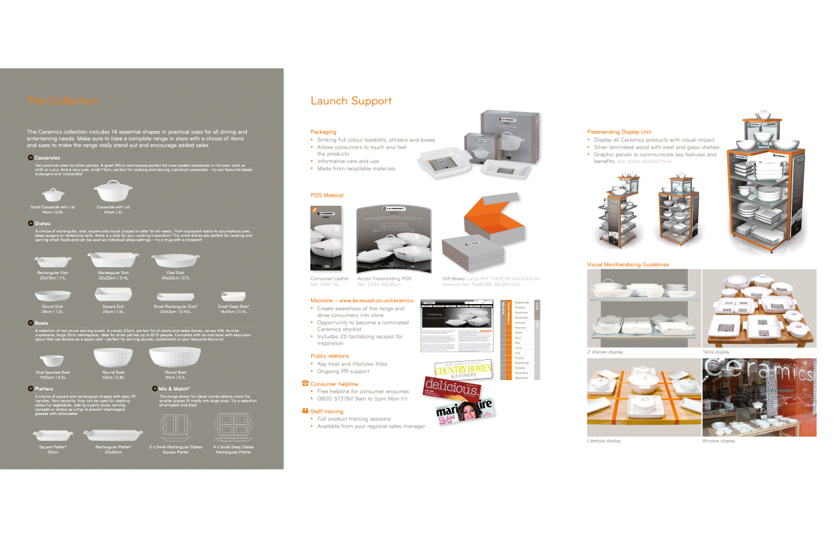
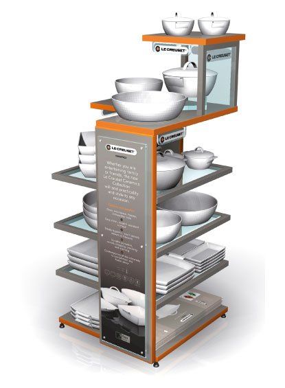
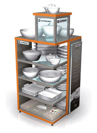
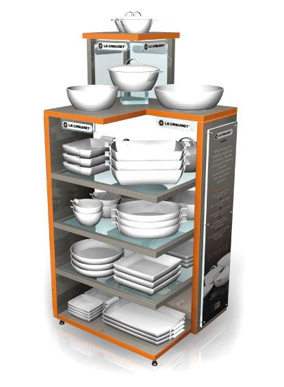
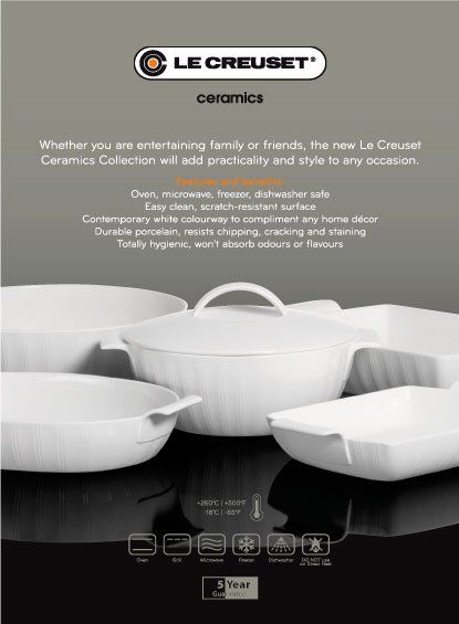
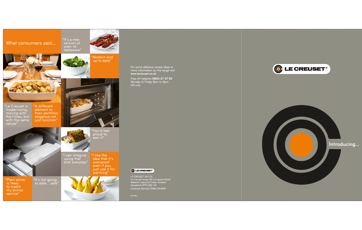
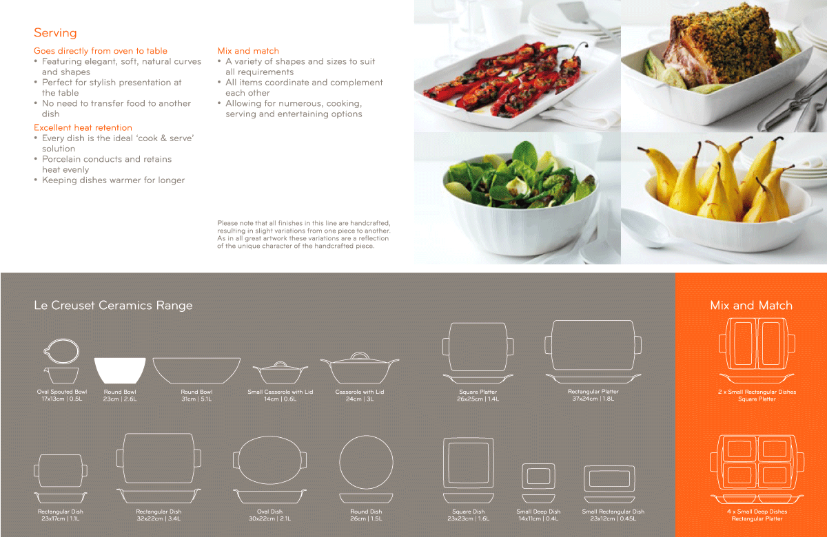
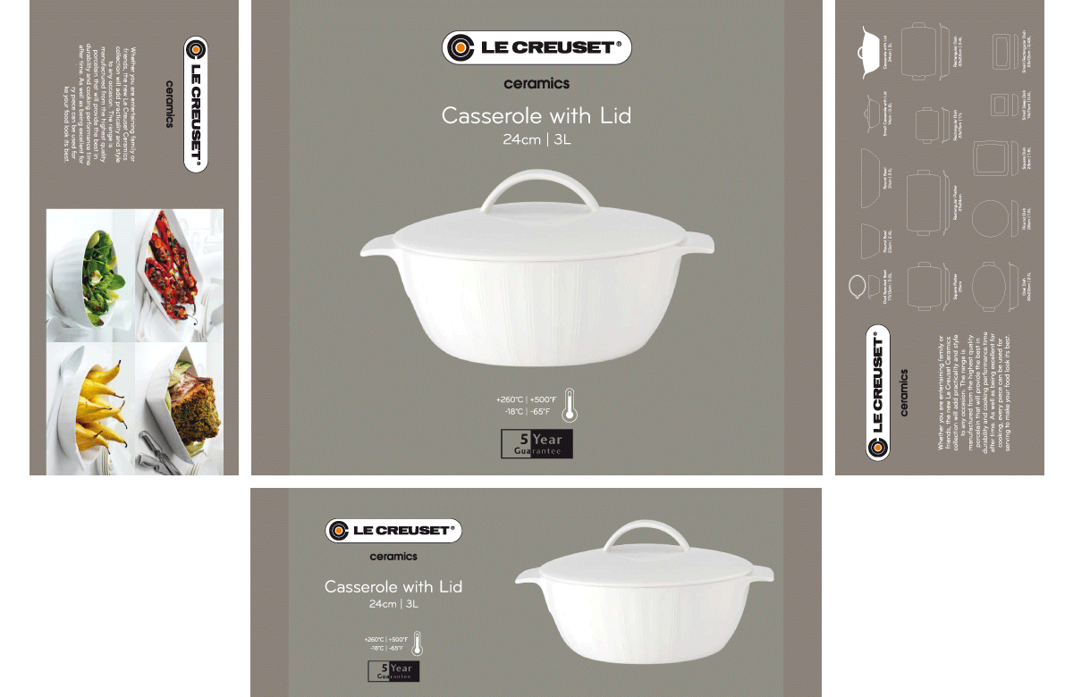
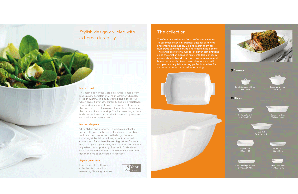
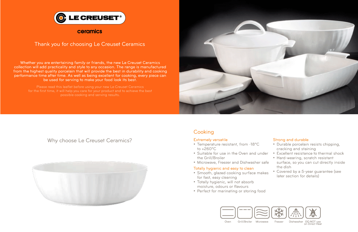
Le Creuset is renowned for its premium cast iron cookware, so the introduction of a new range of oven-to-tableware required an emphasis on brand credentials and impact in store. We developed a fully integrated solution that positioned the range as modern and sophisticated and ensured brand consistency across all applications. From product labels to PoS, trade presenters and product literature, the range had a strong in-store presence and distinct customer appeal.
BHS
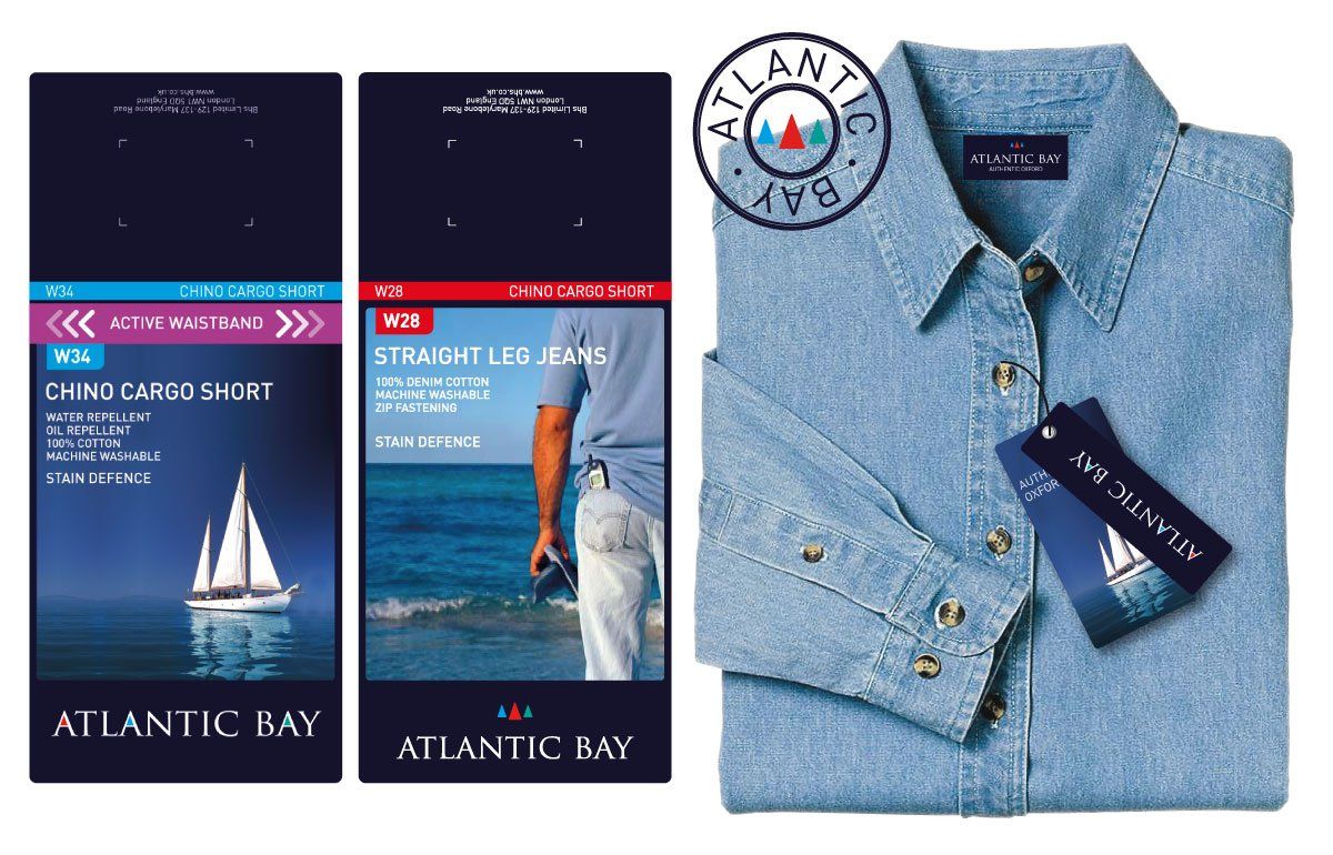
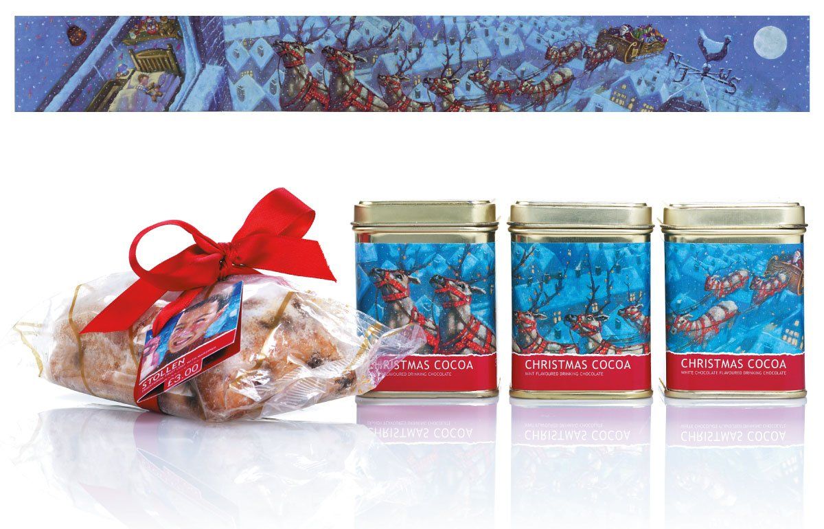
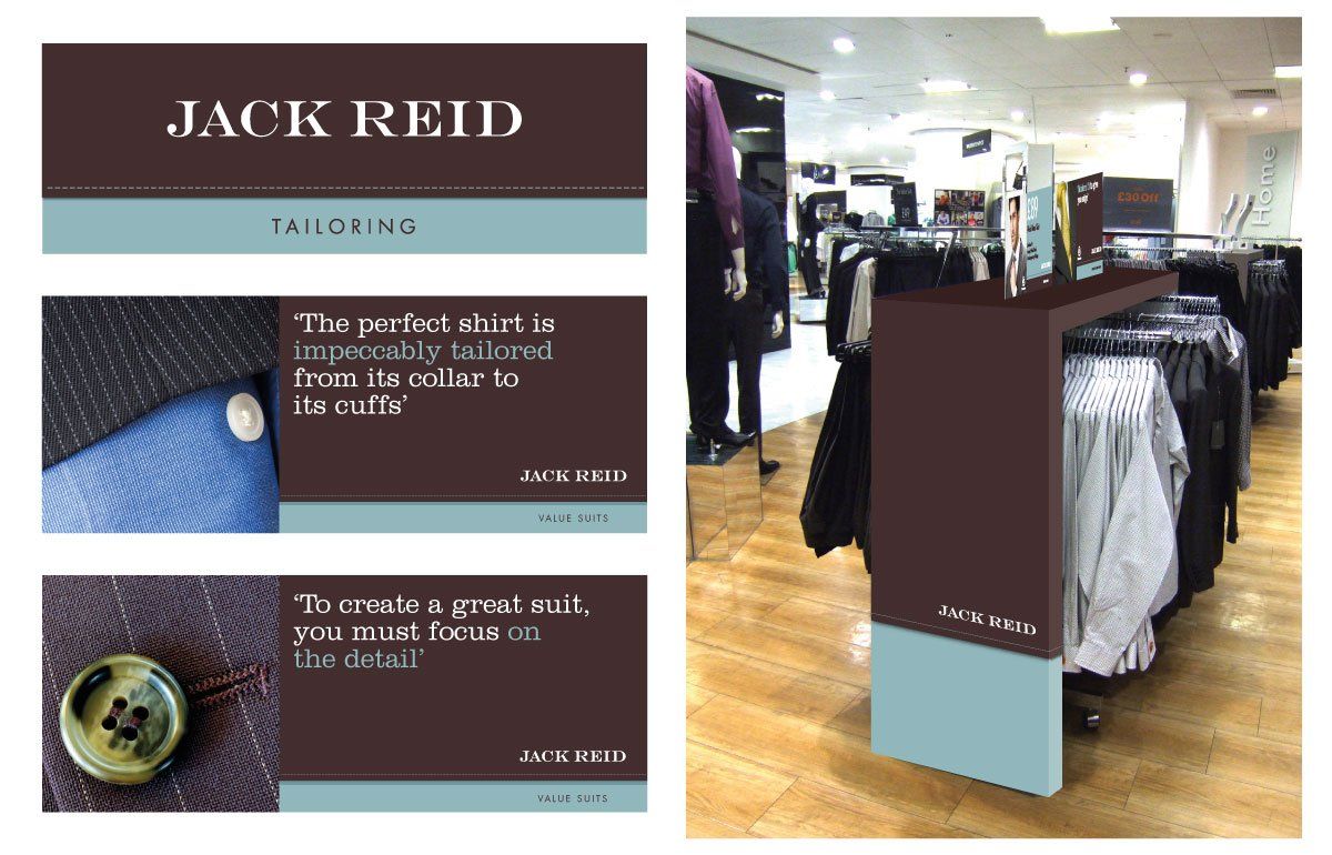
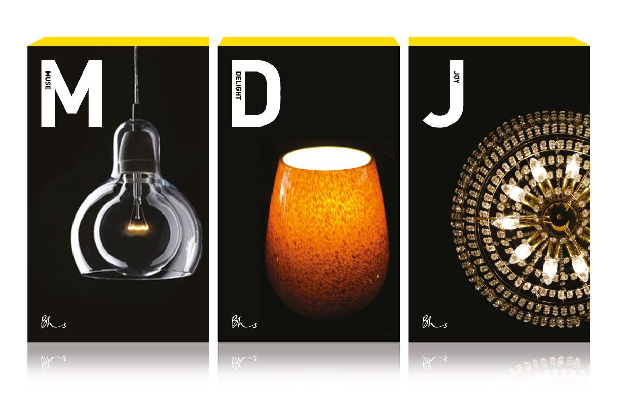
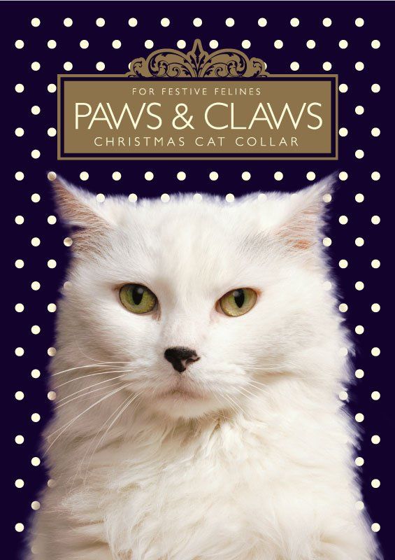
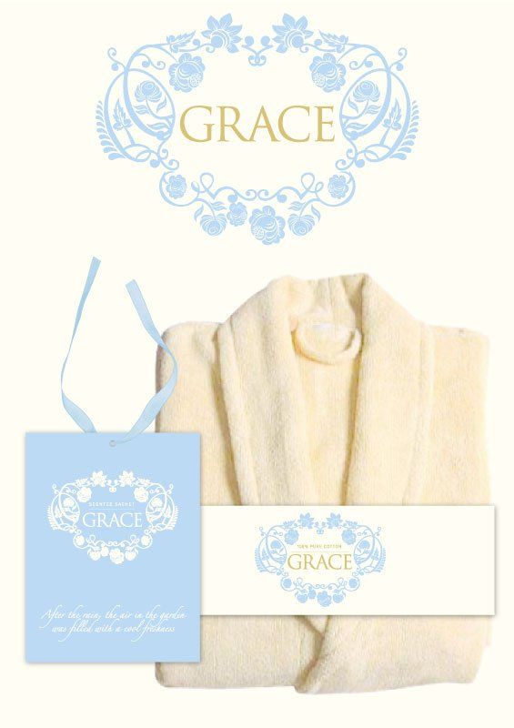
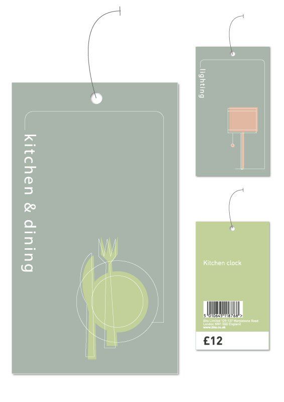
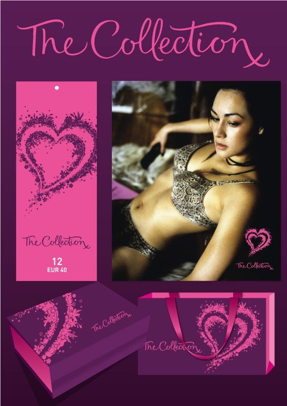
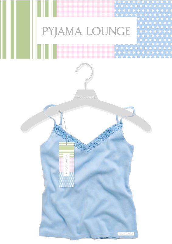
Bhs’ key proposition was always to sell quality products at affordable prices. Its marketing team recognised the role branding had to play in order to compete effectively with other major high street retailers and to successfully attract an increasingly sophisticated target audience. Radius was appointed to create sub-brands for a variety of ranges across clothing, gifts and home accessories, transforming the mainstream into something wholly more desirable. Our remit covered name generation, branding and design application across all customer touchpoints, from swing tags to store fixtures.
PLZENSKY PRAZDROJ
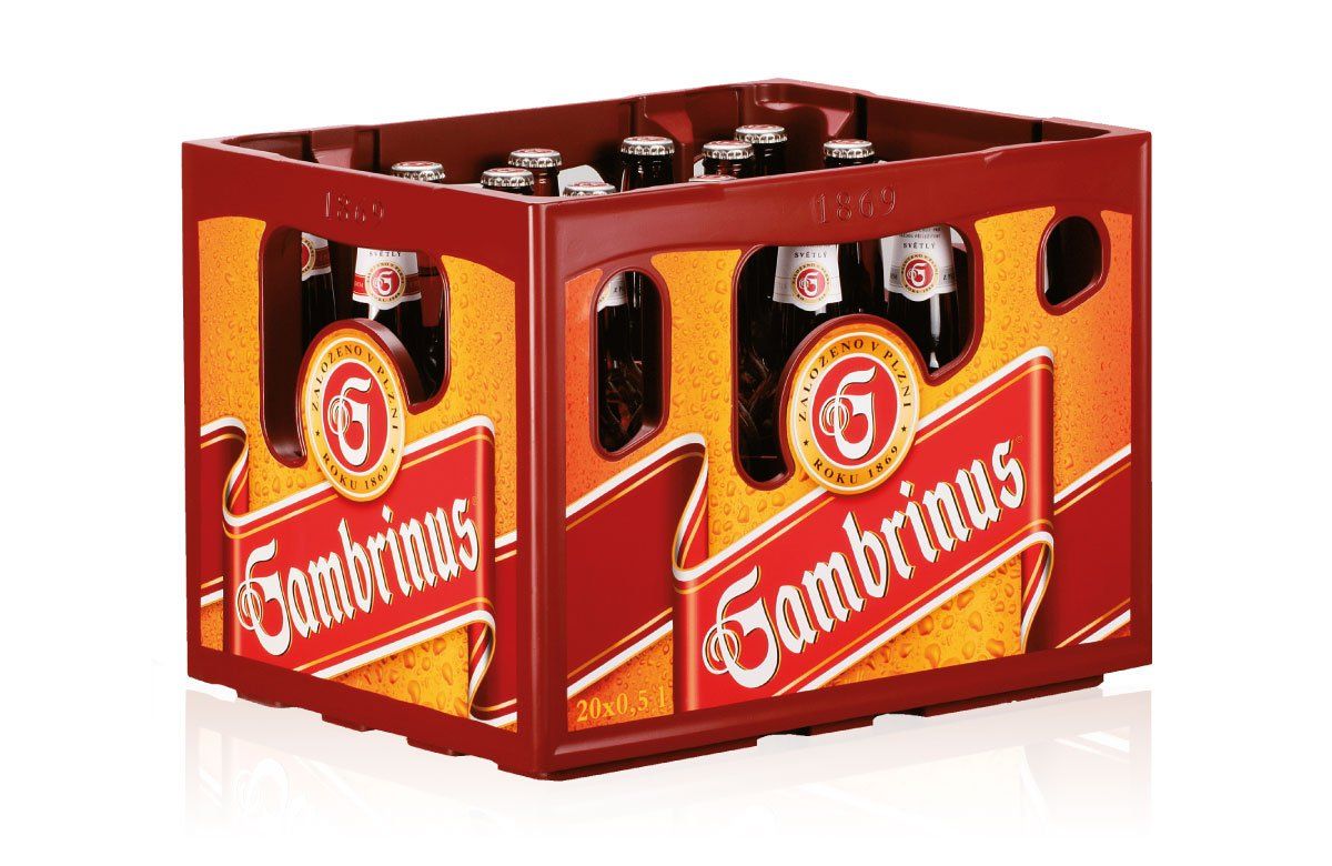
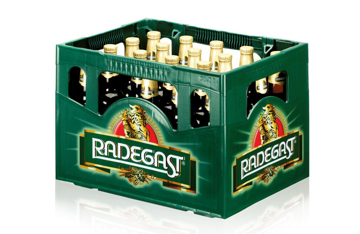
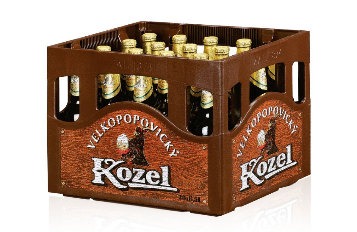
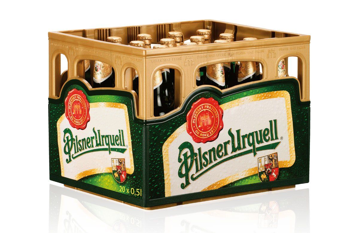
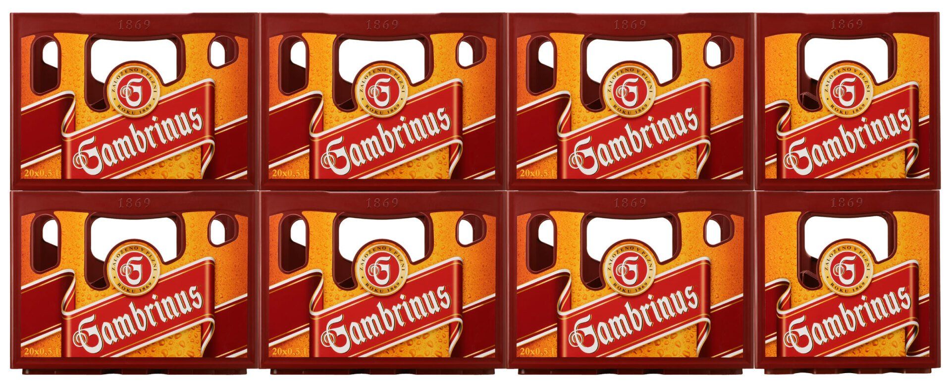
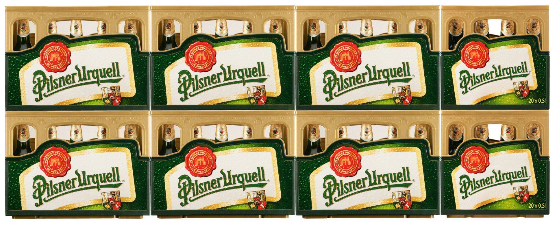
The bottled lager market is highly competitive, and in Europe, with bottles generally sold in crates, brand visibility is often severely restricted. We were asked to reinforce the brand qualities at point of sale for four beers – Pilsner Urquell, Gambrinus and Kozel in the Czech Republic and Radegast in Moravia. We saw an opportunity to push the boundaries of crate design, developing for each brand a distinctive physical structure and utilising in-mould labelling to best effect. This was carefully balanced with meeting mandatory requirements such as durability and light protection for the bottles. Each solution ensured strong visual impact from every angle when merchandised in store. Greater standout and differentiation quickly delivered improved sales figures, including a 20% year-on-year increase in sales of Gambrinus.
SAFEWAY STORES PLC
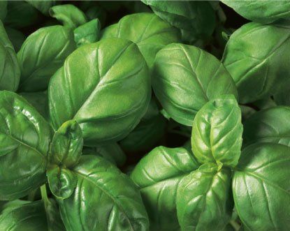
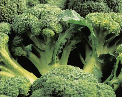
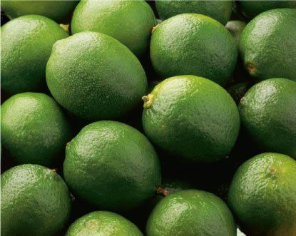
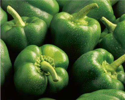
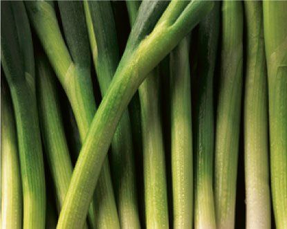
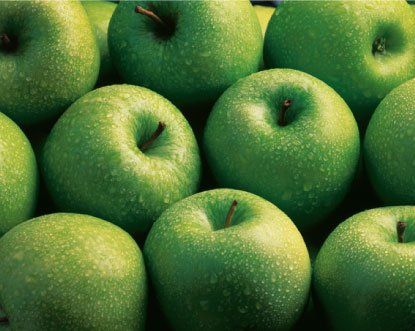
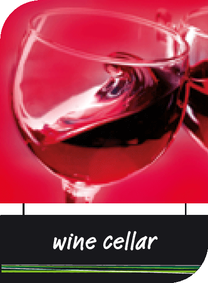
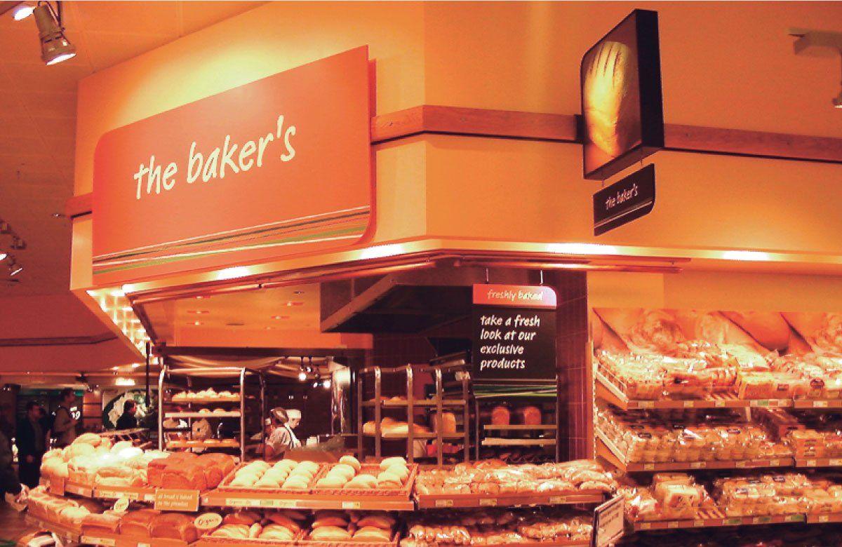
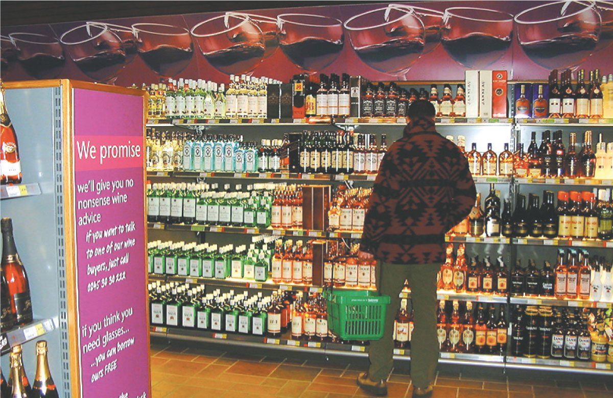
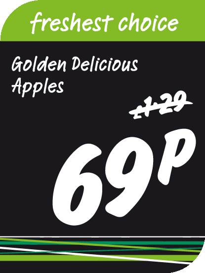
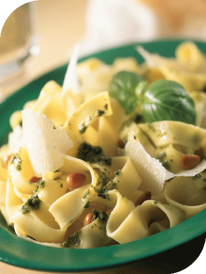
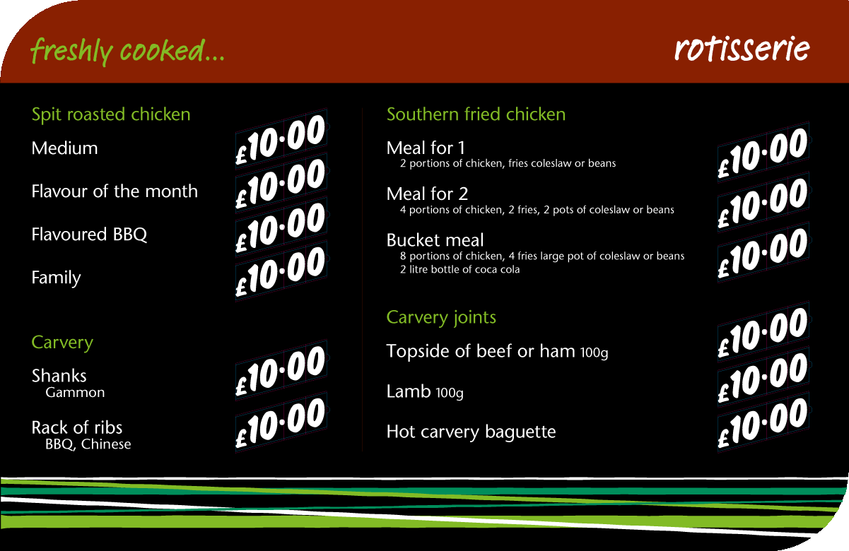
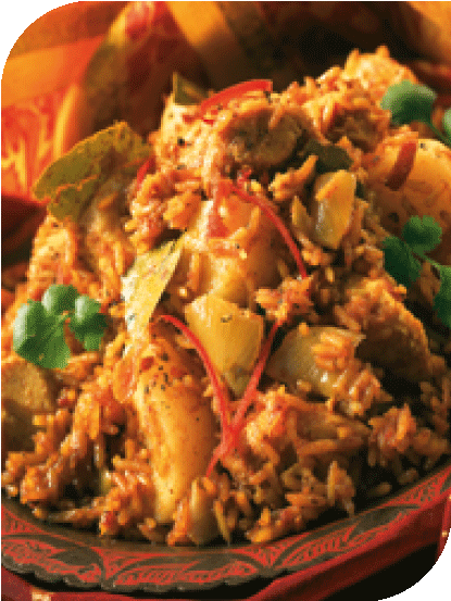
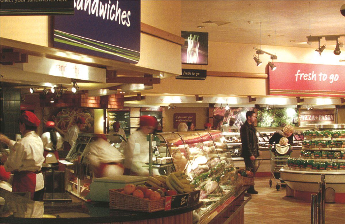
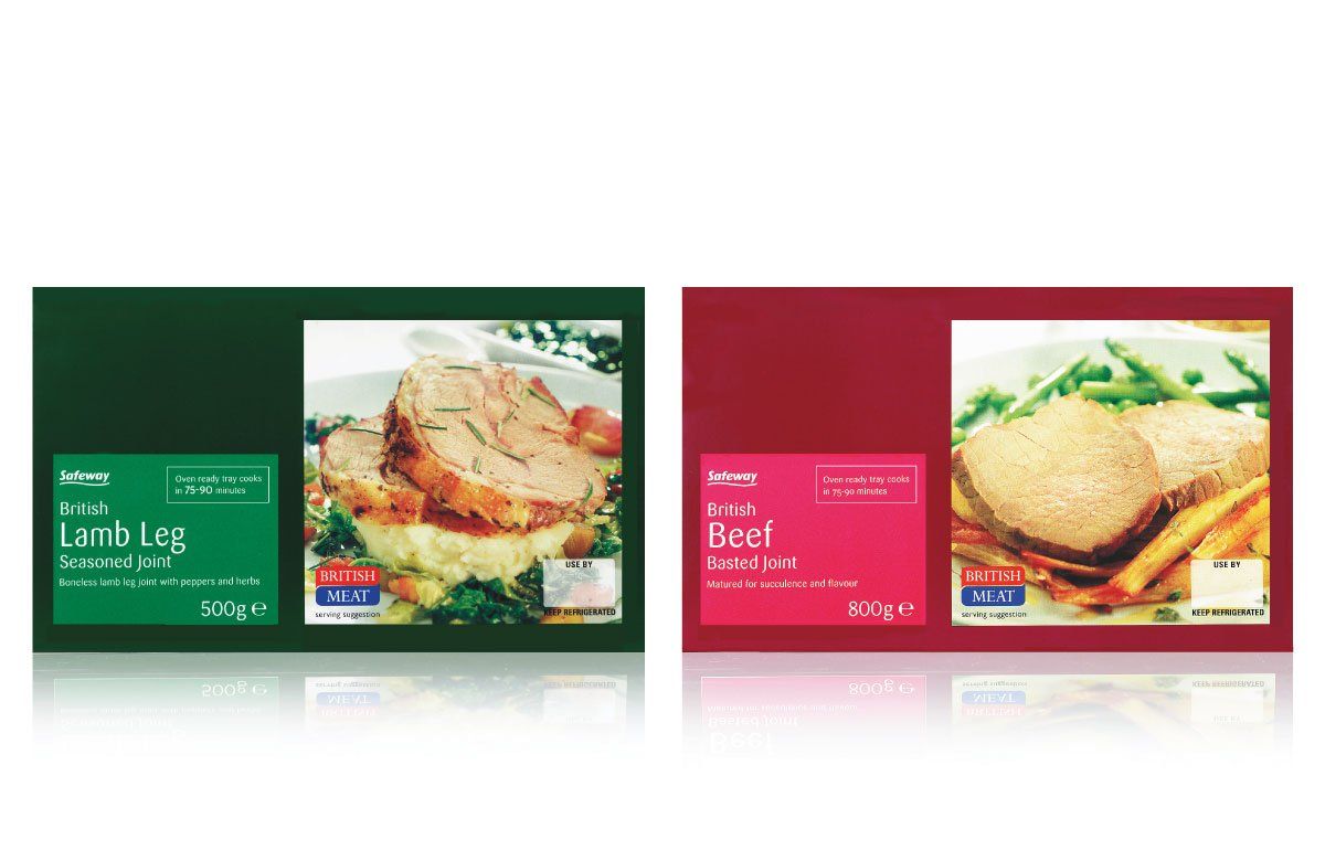
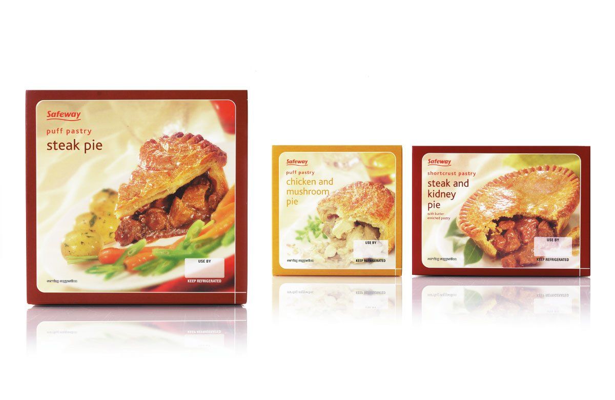
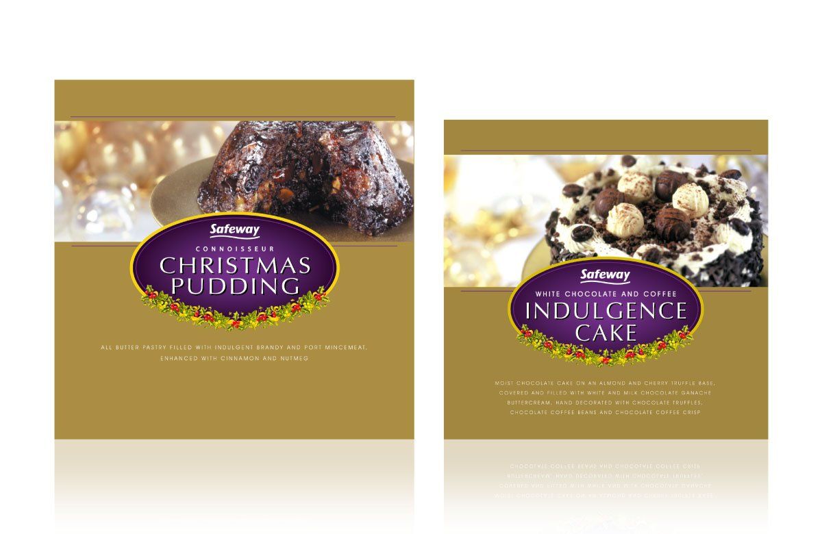
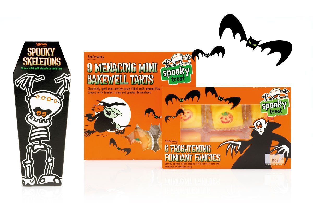
The UK supermarket war has always been intense, with the top retailers constantly fighting for greater customer share. When Safeway chose to reinvent its offer, Radius was briefed to create and implement a complete visual communications strategy. Drawing inspiration from fresh food markets, we set out to create a shopping experience that would support Safeway's new brand proposition ‘passionate about fresh food and great value’. Within six months Safeway gained 750,000 new customers and experienced a 31% growth in profits, shares more than doubled and numerous industry awards were won.
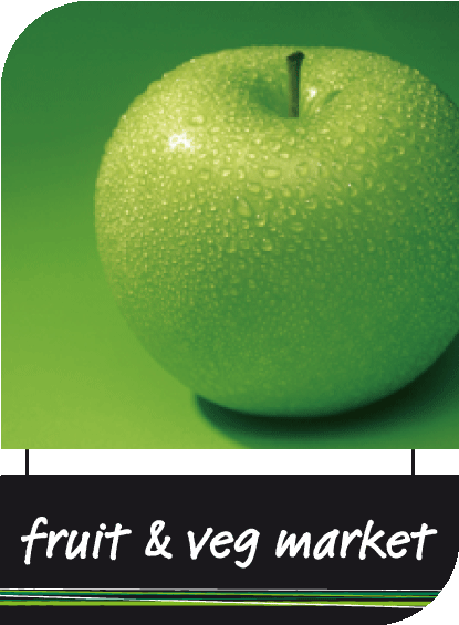
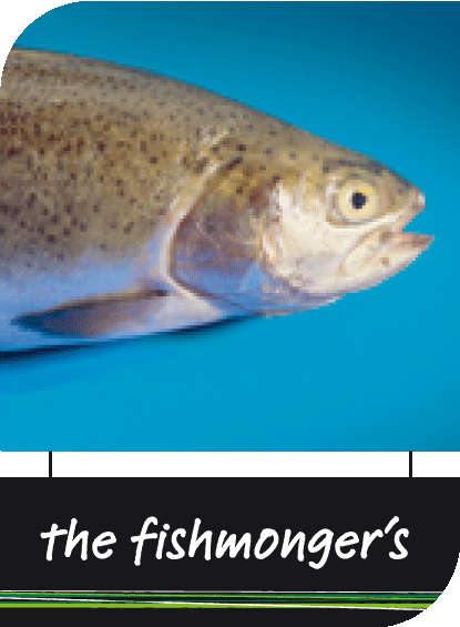
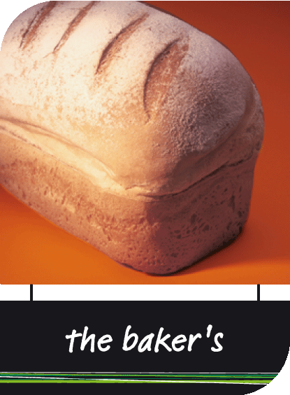


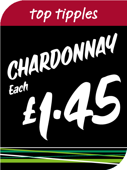
SAFEWAY STORES PLC
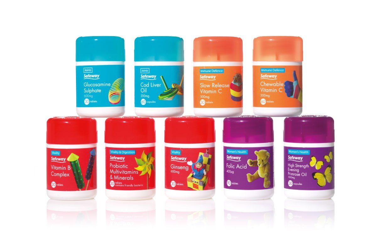
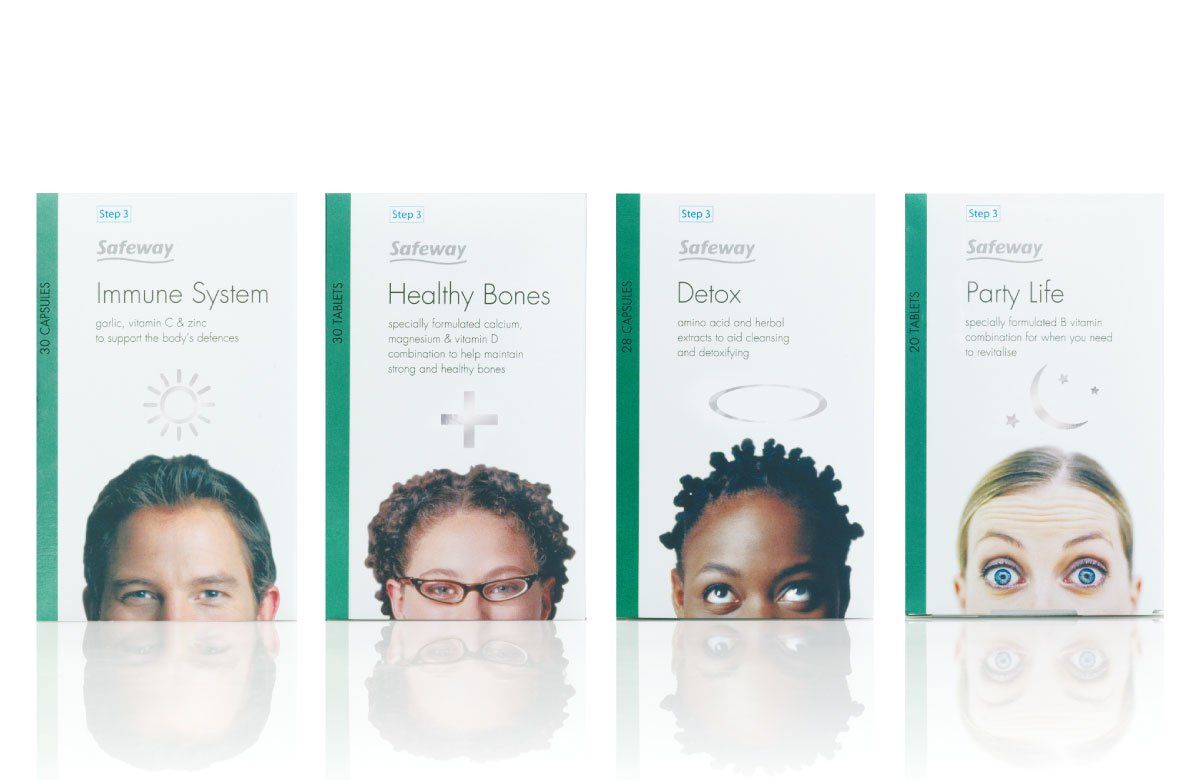
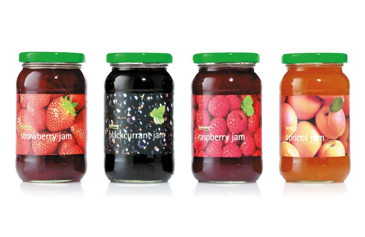
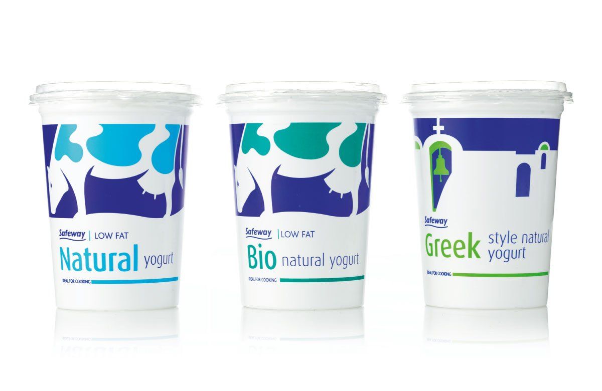
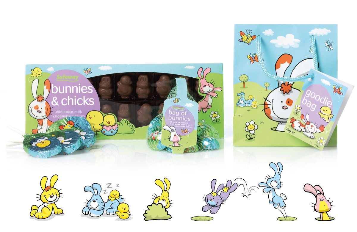
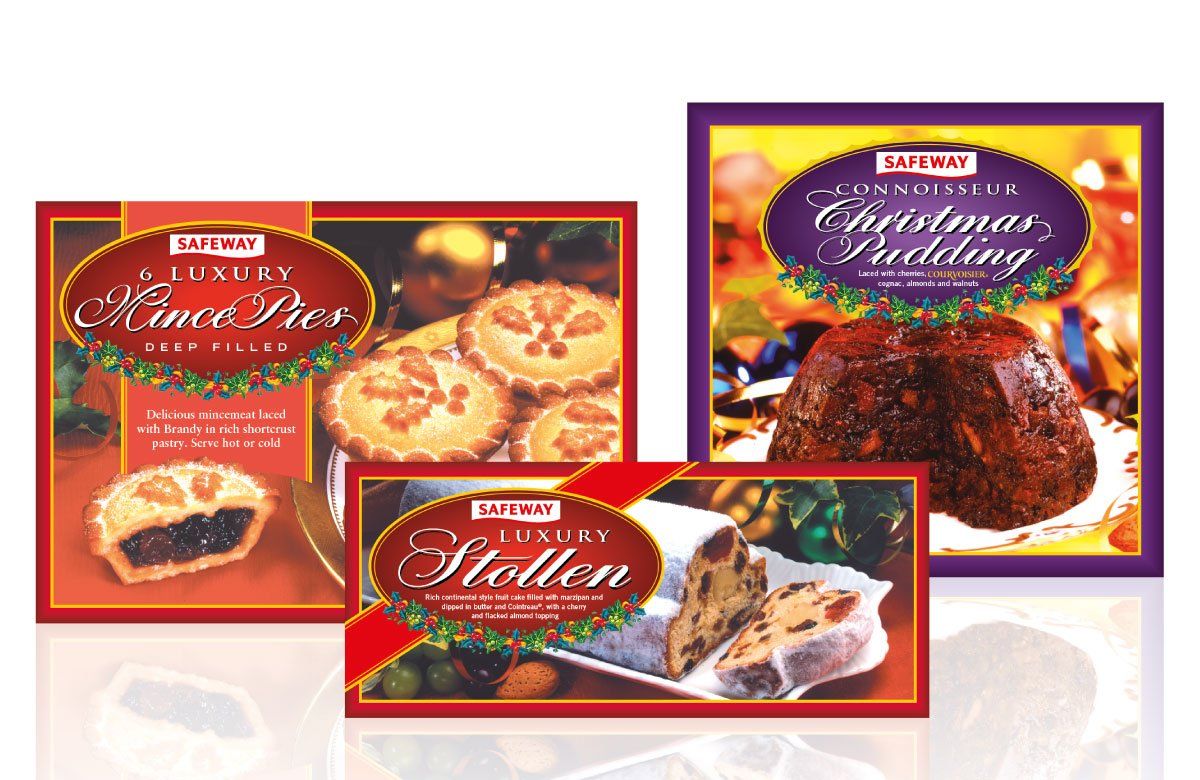
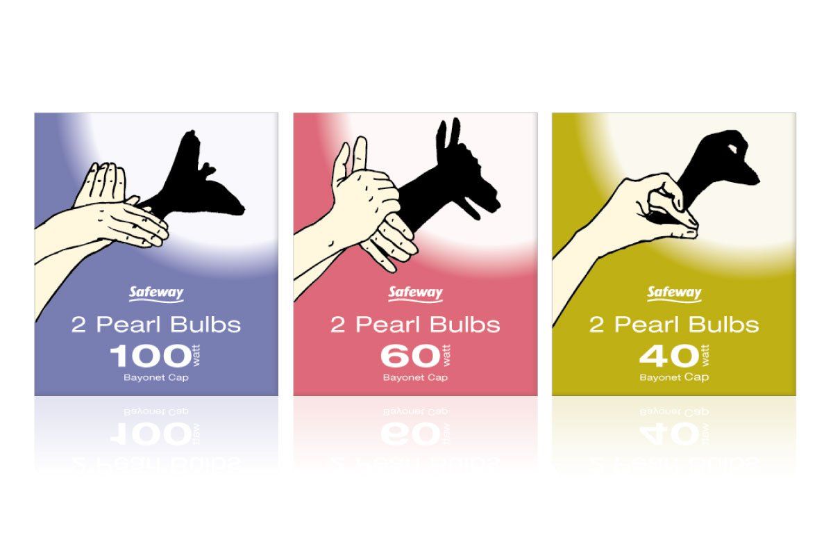
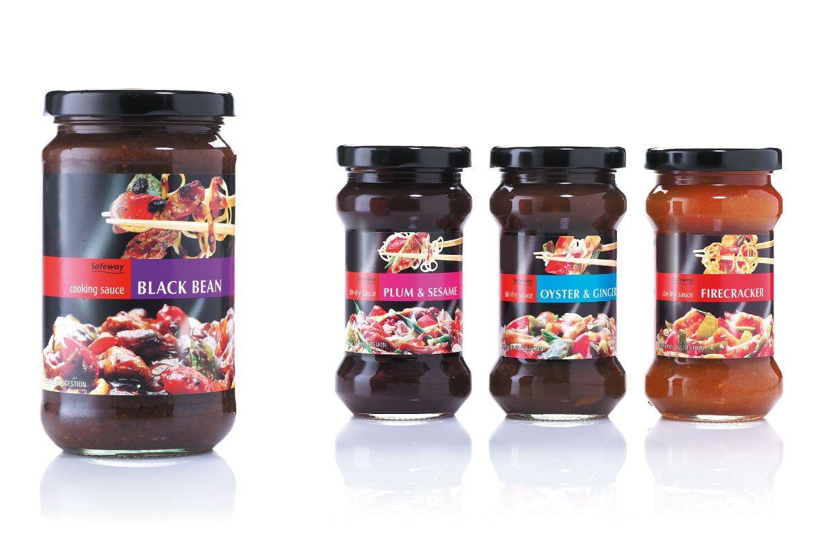
As a rostered agency for over 10 years Radius was responsible for the design of own-brand packaging, from single lines to ranges exceeding 100 products. Creating standout on shelf to attract the attention of customers was always the primary objective. We ensured a distinctive, fresh and innovative solution to every project, whether it was for household basics such as rubber gloves or the extensive and indulgent range of Christmas foods. Consistent uplift in sales demonstrated that the packaging enabled own-brand products to compete effectively with brand equivalents.










ORIGO
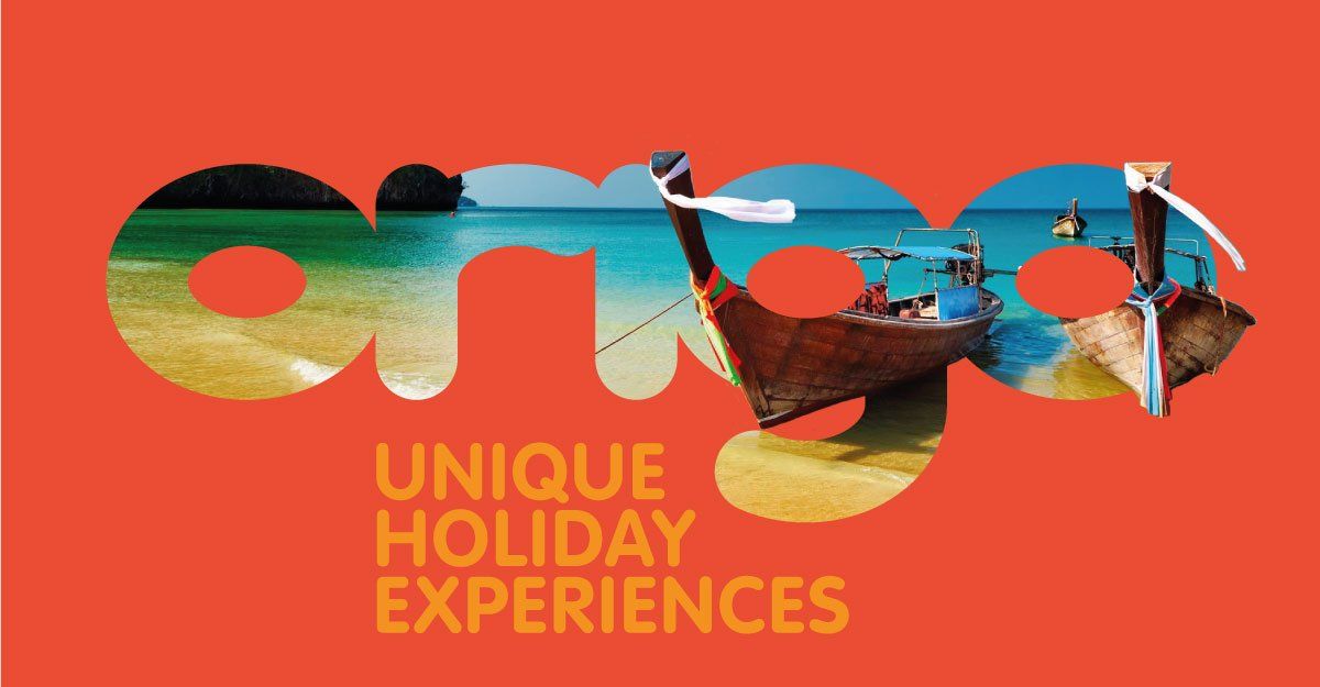
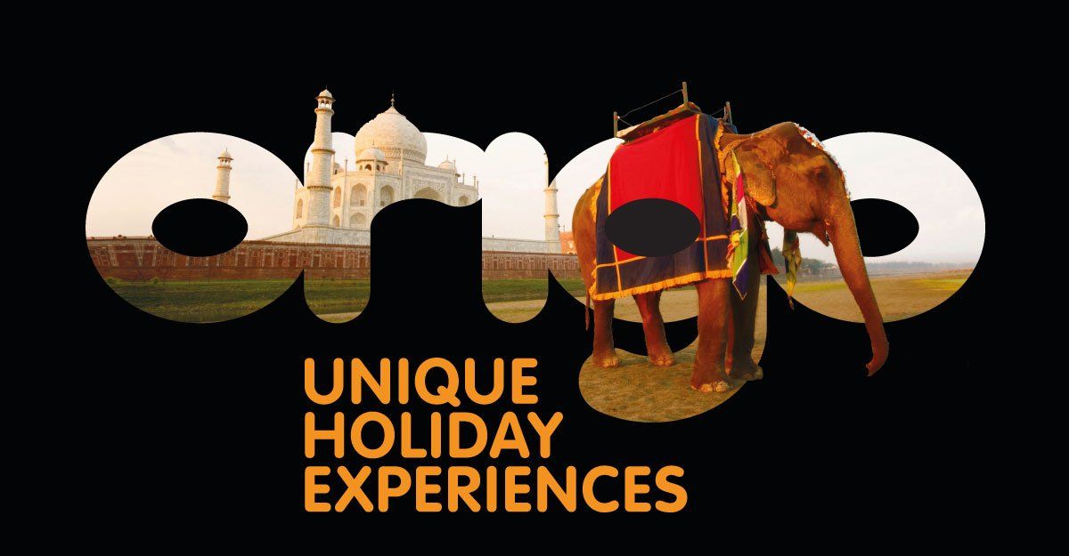
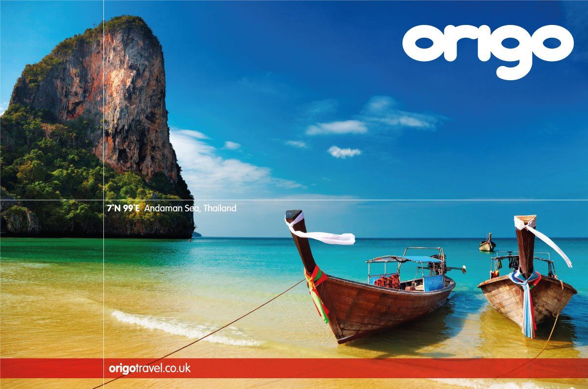
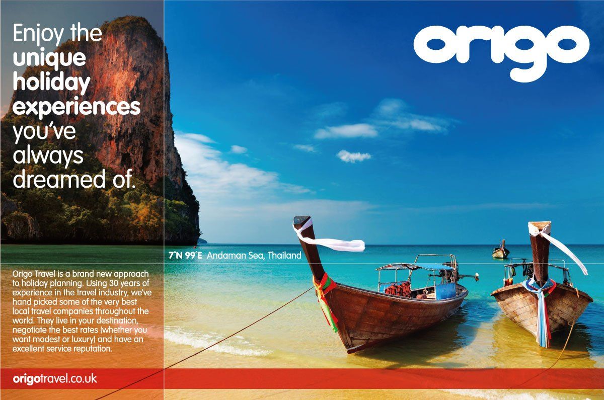
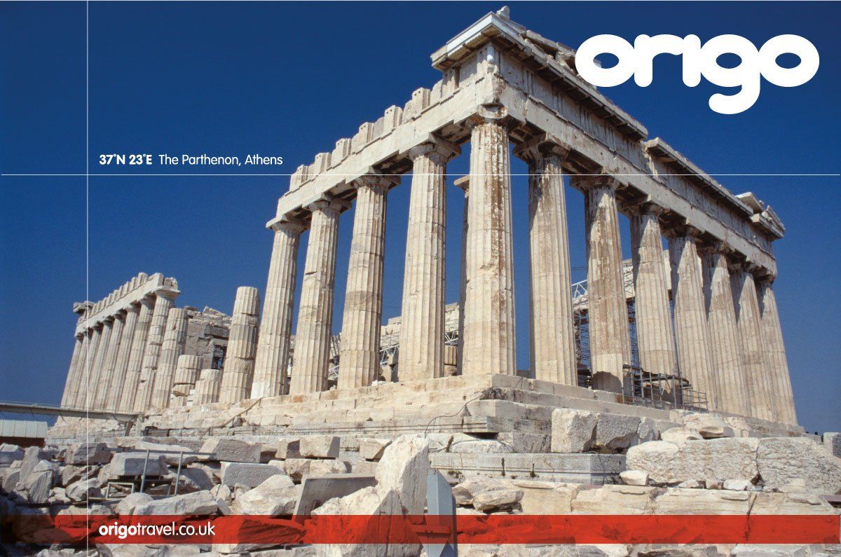
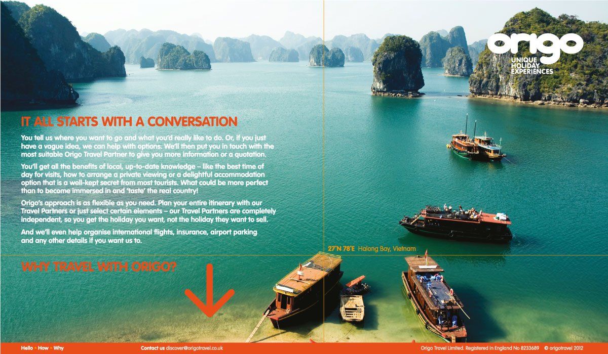
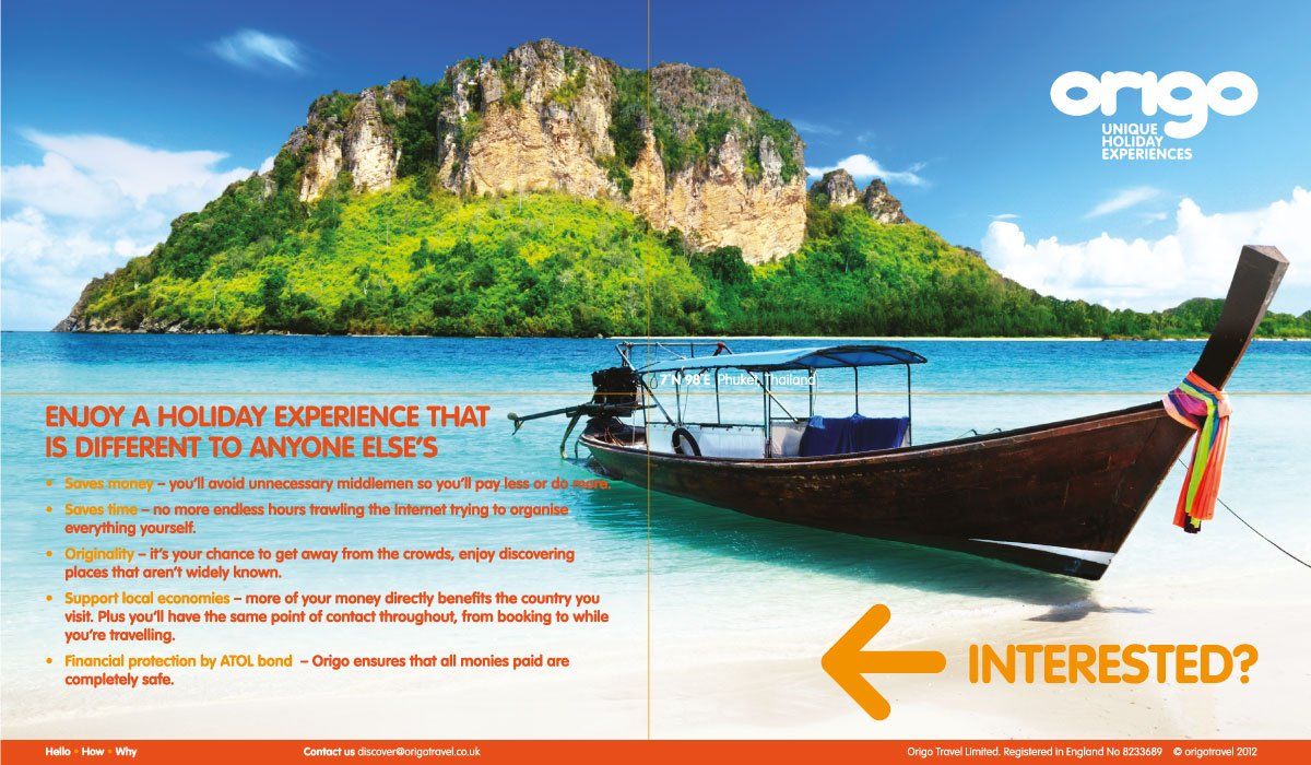
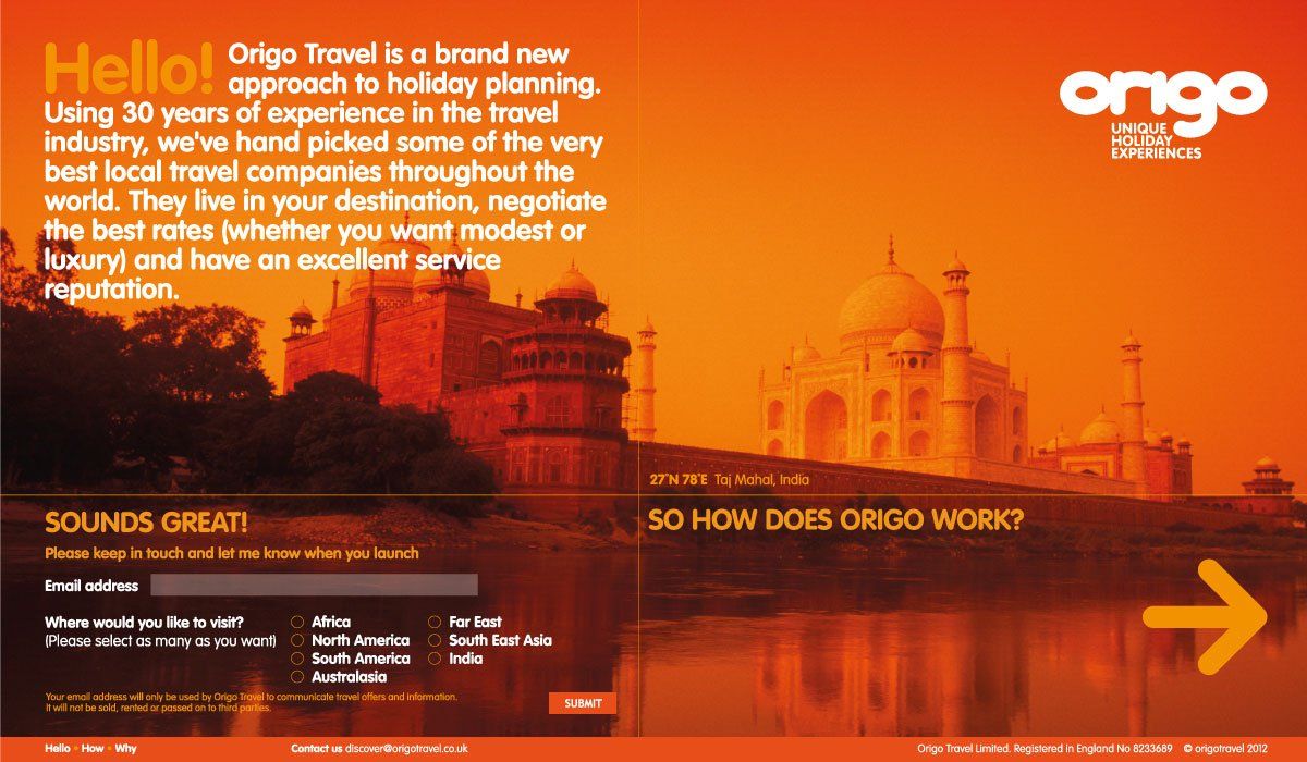
Having previously worked with Radius, our client was keen to get us involved in a new business venture. Aimed at adventurous travellers who seek out alternatives to package holidays, the business utilised the local knowledge of travel experts around the world to plan and deliver unique holiday experiences – an online service designed to save customers many hours of searching on the internet. We were involved from the very beginning, including brand name generation and developing the tone of voice, to build a brand that would be perceived as reliable and trustworthy and a credible alternative to mainstream holiday providers.


WILLOW BROOK PRIMARY SCHOOL
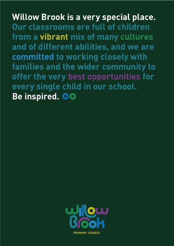
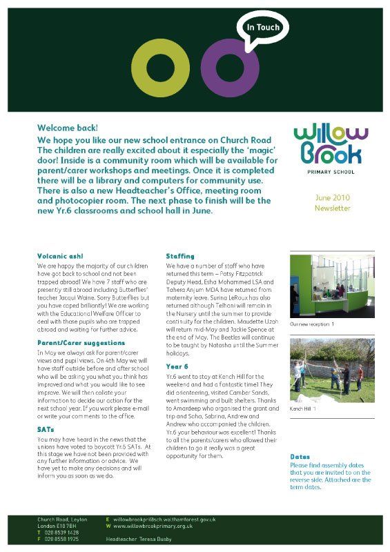
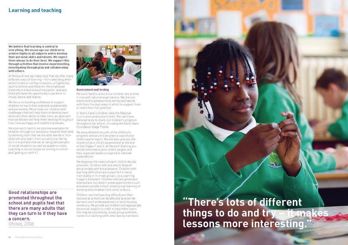
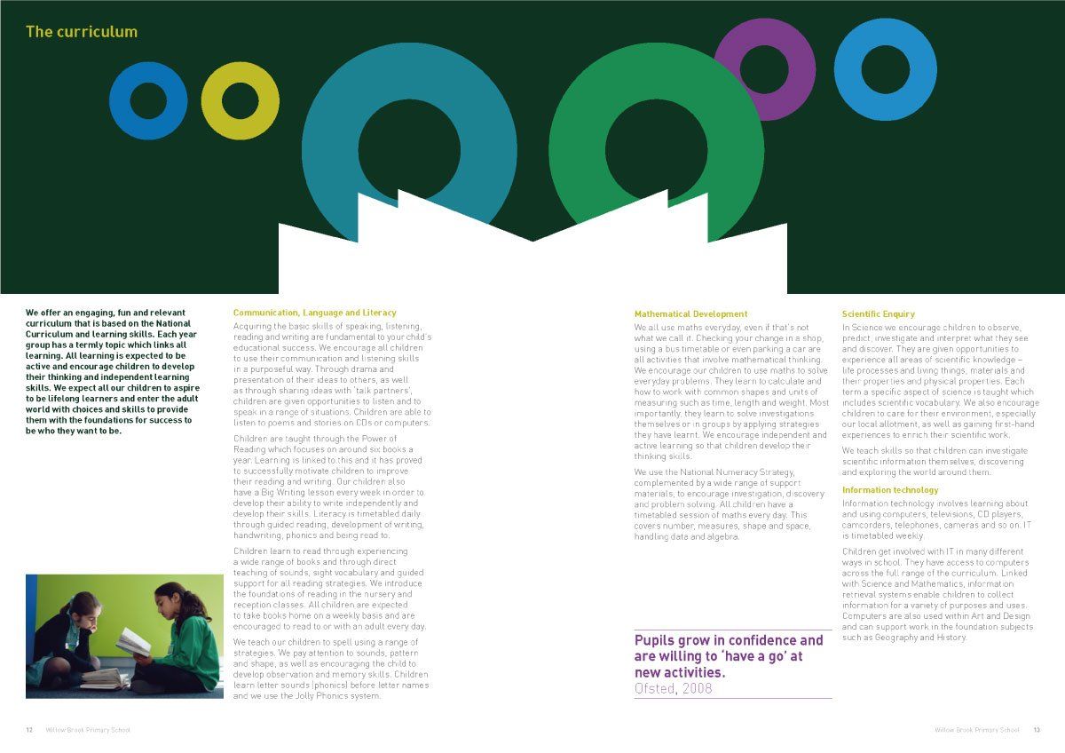
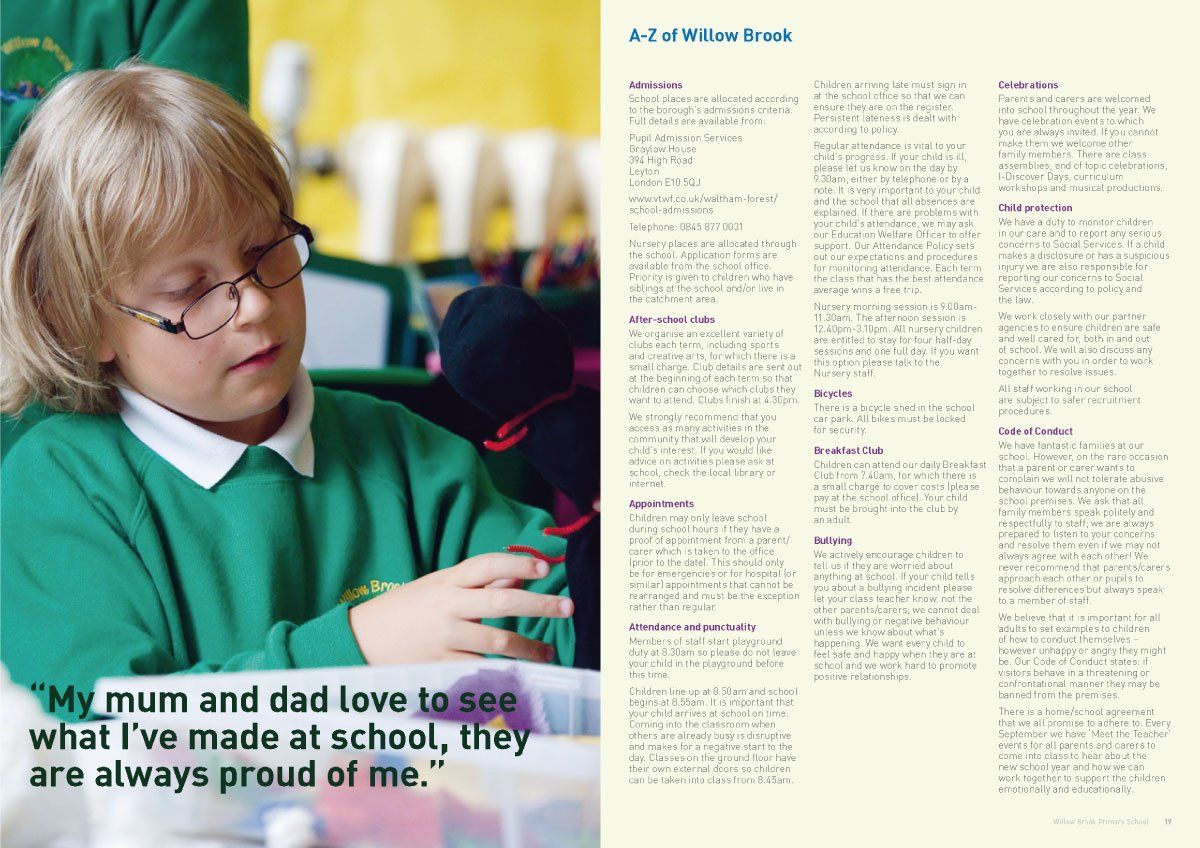
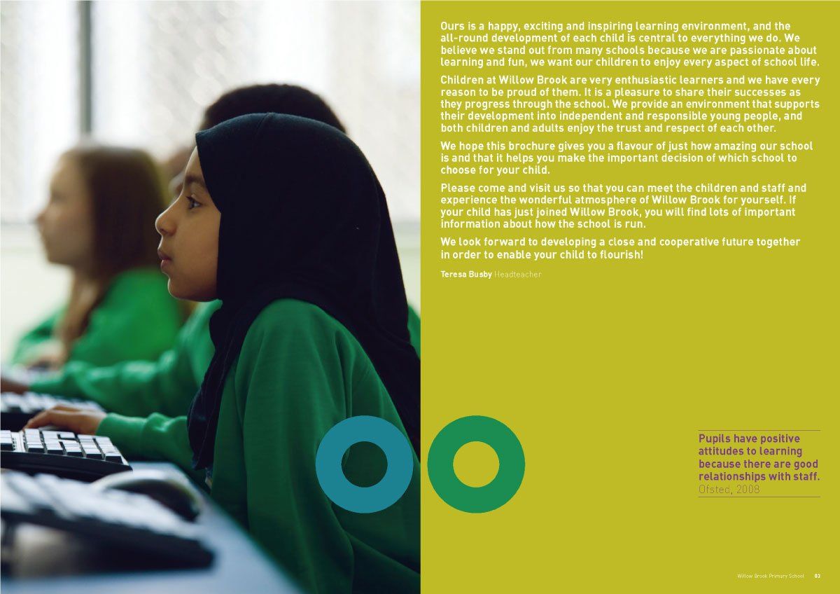
The build of a new and modern extension to this school’s Victorian building was the perfect opportunity to review how the school promoted itself. Willow Brook was a full re-brand programme, driven by the then headteacher’s refusal to conform to the typically low expectations of an inner-city school. We created a brand identity that is fun, colourful, dynamic and vibrant – everything a primary school should aspire to be. Supported by a new website, prospectus, uniform, environmental graphics and signage, we helped convey the school’s commitment to helping every child achieve their potential and engendered a new sense of pride in staff, pupils and parents alike.



OTHER BRAND identities WE'RE PROUD OF


© RADIUS BRAND CONSULTANTS 2022